Journey is a mindfulness app for tracking habits, moods, goals, self-affirmations, and displaying the resulting data visually. This provides a narrative arc to one’s personal journey, as well as feedback on habits and life patterns that may provide insight on how to change or improve them. This case study shows the design process for the Material Design version prototype of Journey.
Journey began with the idea that there could be a better to-do list mobile app that fits into daily routines. Along the way, there was a pivot in the design to something both much more specific and more expansive than a simple to-do list. The evolution of the Journey app from personal task management app into a tool for mindfulness, goal-tracking, mood journaling, self-affirmations, and activity logging is one that evolved through careful listening, questioning, and iteration of design ideas.
In the early stages of my design, while researching to-do apps and task management software, I discovered that a lot of people just don’t really like using apps to track personal goals. Task management software has become nearly ubiquitous at work, and I found most people simply don’t want to log their own personal tasks into a device on their free time.
The thing that people were interested in was a method to track more than just tasks and to-do lists. People are naturally curious about themselves; almost all of us would like to be more present and more self-aware.
In my conversations with behavioral therapists and psychologists, I learned that what they need is a tool to help their clients to articulate their feelings, to better express their moods and emotions. To be able to track these moods over time would provide users and therapists with an incredibly powerful set of data to work with. I reimagined my to-do list app as a tool for people to pay more attention to their thoughts, feelings, daily habits and aspirations as a way to achieve more in life.
Several rounds of surveys were held, the first written with the intention of making a better to-do list app. This found that people generally like to start using to-do list apps with enthusiasm, but then usually stop using them after only a couple of weeks (over 50% of those I surveyed said they stopped using a personal task management app after just two weeks, nearly 80% reported that they stopped using one after a month).
Shifting away from a strictly task management concept for an app, follow-up surveys focused on what people do like to do with an apps, what kind of data they actually do find useful to log and track, and what kinds of device interactions could be habit-forming and helpful.
Trends toward less mundane task-logging, and for using more generalized wellness and mindfulness tools emerged from my results.

From formal recorded conversations to casual chats over coffee, I made sure to meet with a diverse set of professionals and laypeople to gather ideas, feedback, and new data. Psychologists, behavioral therapists, art therapists, project managers, power users of task management apps, educators, as well as other designers and developers were all welcome contributors to the formation of my early design concepts for the app.
A handful of mindfulness apps already exist for iOS and Android devices. I tried out as many as I could find, noting what features were offered, presentation of tools and interface, differentiators and similarities between related tools. Wellness apps I tested ranged from guided meditations to soothing soundscapes to portals for various wellness forums.
This chart compares features ranged by relative ease or difficulty of implementation compared to value in utility to the operant. A graphical breakdown of features can help determine which will go into an initial build, which could be held off for a future release, and which could be scrapped altogether. For example, I decided to leave out geolocation mapping and notifications from the first iteration due to its higher difficulty to implement and relatively lower value to the operant, though I did include the more difficult to implement multi-directional mood tracking, due to its higher use value.

A designer often needs to become an expert (or at least very well-informed) on a subject in a very short period of time. Tools we build may be operated by people with far more experience than we have; these tools had better serve those using them well, or risk being abandoned.
Without the many years of specialized training in behavioral psychiatry, the credentials of a therapist, or the emotional literacy of a psychologist, I turned to those who did — and who have written on the topics. The Dalai Lama and The Paul Ekman group teamed up to create a digital tool called The Atlas of Emotions. I used this to gain insight on affect theory, along with others; especially those of Robert Plutchik, who envisioned the range of basic human emotions as an eight-fold wheel.
An “Ah-Ha!” moment occurred for me upon discovering Robert Plutchi’s Wheel of Emotions. Nearly all the mindfulness apps I tested that featured affect logging (emotion tracking), none had more than a simple slider between “good” and “bad,” or some other binary scale between positive and negative. Emotions have so much more depth, and here was a wonderful graphic visualization of the range of emotions humans feel, and a chart for how they relate to each other. This would be incorporated into the Journey interface design, and become the backbone of the Mood Journal feature of the app.
Other sources include Harvard, the National Institute of Mental Health (NIMH), Psychology Today. Surprisingly, the most useful research on self-affirmations came from a collaboration of the Stanford School of Business with the Department of Brain Sciences at UC Santa Barbara.

User personas, operant personas, however one calls them; they’re an essential tool to help UX researchers, UI designers, software developers, and business development teams communicate effectively with each other about the people who are using the tools that they build.
They may represent an actual, specific person, but more often are a generalized set of statistics that represent a typical person that falls into a target demographic of those who would use the product.
Here, three personas were created to represent typical users of the Journey app. The traits for each persona were gathered from statistics available at the National Institute for Mental Health (NIMH), data presented in academic reports on mindfulness and affirmations, from my survey results, and from interviews.


How will people use this app? What tasks will people perform when operating it, and in what order? How will they navigate the app? A task flow diagram is a way of visualizing how the app will be commonly used in typical scenarios, so that features and screens can be built to accommodate for all possible user interactions. Additional task diagrams may be created for more detailed interactions such as logging in or setting up accounts, edge cases, and error handling.
Here, every possible action a user may make in the Journey app, aside from logging in or creating a new account, is mapped out. Additional diagrams were created for the log-in scenarios.

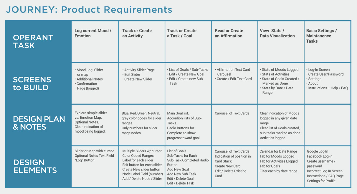
What is the plan of action for the design? What will each screen contain? Which features will go where? A product requirements document details elements, assets, and features to be built based on the user’s task.
The product requirements document contains a more detailed list than a site map or task flow diagram of each feature to be built for each task. This can act as a checklist of what needs to be built and where it will go. Features common to several tasks can be identified, which can prevent asset duplication.
Blueprints for each screen and feature of the app, with details of layout and asset design, to visualize the functionality and structure of the UI, and how it all fits together.
Several dozen wireframe screens were created for Journey, with some features involving several iterations in order to try different approaches and different solutions to the same problem. Here, three different solutions are presented for the mood logging feature, which can be tested in group settings and examined in discussion groups.


During my decade-long career as a graphic designer (and even longer as a studio artist), I’ve done extensive research into how humans perceive color. When my attention turned to creating a color palette, I was already certain that shades of blue would be most effective for this app. Blue makes us feel calm, tranquil, at peace. Deep blue is associated with intellect and consciousness. Purple is associated with emotions, creativity, spirituality and wisdom.
Shades of blue ranging from a lighter cyan to a deep, rich lavender-blue were implemented for the color palette to evoke mindfulness, self-reflection, and inner confidence.
Icons for navigation and identification of sections in the app, as well as the logo, are inspired by Tibetan mandala art, Japanese mon emblems, and western sigil icons.

With the layout structure and feature details of the app design now mapped out in wireframe, and the graphic style set by the visual design & branding document, I assembled these pieces together into a coherent, comprehensive design.
The resulting Sketch document contained a total of 86 screen designs. These were then used to build the initial click-through prototype.


To test the design and functionality, I created a prototype in InVision, my go-to tool for cloud-based usability testing.
Testing with real people interacting with the app, making unexpected decisions and doing things you never expected, is the most important part of a design process. A designer can think they’ve planned for everything — that is, until it’s tested in by actual people who have never seen it before. There are inevitably unexpected actions a tester will make, design patterns that seem obvious to a designer but are puzzling to the operant, and new questions that arise which may involve further iterations and different solutions.
These prototypes are the result of several rounds of testing, tweaking, making many incremental changes after feedback from a few dozen testers. I always try to give the tester the minimal amount of input before they see a the prototype, and I’ve experimented with providing a set of actions to perform versus no set actions at all. This gives me a sense of how intuitive people find the features to be.
While Journey is a good prototype, it's not yet a completed application. I'm continuing to test, iterate, and update the app, with the ultimate goal of building it in React Native for Android and iOS platforms.
Better filters are in the works for the data visualization features of the app, to provide better pattern recognition for the user about their data. Tool tips and instructions for each section is another planned feature.
Overall, I believe Journey to be an excellent concept, a design I think is worth putting in the additional time and effort to see to completion.
Animation of usability testing from an interactive prototype.
Results from an online survey regarding habits for tracking one's personal tasks, habits, and moods.
Features graphed by ease or difficulty of implementation versus value to the user.
Plutchik's wheel of emotions was a pivotal reference point for the design of Journey. Other resources include research from NIMH, Stanford, NAMI, Psychology Today, and more.
Meghan, a user persona representing a common type of Journey user, based on my research.
Robert, a user persona representing a common type of Journey user, based on my research.
Samantha, a user persona representing a common type of Journey user, based on my research.
Information architecture document mapping user action sequece of events.
List of assets and features to be included in the initial launch of the product.
Detailed blueprint including layout of all assets and features for an individual screen in the app. Option 1 for mood-logging feature; simple slider.
Detailed blueprint including layout of all assets and features for an individual screen in the app. Option 2 for mood-logging feature; 8-track slider.
Detailed blueprint including layout of all assets and features for an individual screen in the app. Option 3 for mood logging feature; circular 8-path target.
Detailed blueprint including layout of all assets and features for an individual screen in the app. Activity logging screen, with color-coded sliders.
Detailed blueprint including layout of all assets and features for an individual screen in the app. Screen for creating a custom activity, with options for color-coded slider sections.
Detailed blueprint including layout of all assets and features for an individual screen in the app. A new activity (NewAct) has been added to the activity tracking screen.
Detailed blueprint including layout of all assets and features for an individual screen in the app. Layout option 1 for affirmation card display.
Detailed blueprint including layout of all assets and features for an individual screen in the app. Layout option 2 for affirmation card display.
Detailed blueprint including layout of all assets and features for an individual screen in the app. Screen for writing one's own affirmation.
Style and Branding guide with logo, color, icon, and typography samples.
User Interface design, including final styling for features, color, typography. Drop-down menu over activity screen.
User Interface design, including final styling for features, color, typography. Mood logging screen with 8-path target layout.
User Interface design, including final styling for features, color, typography. Mood logging screen with 8-path target layout.
User Interface design, including final styling for features, color, typography. Confirmation screen for mood logged.
User Interface design, including final styling for features, color, typography. Goal tracking screen with option to edit or delete a goal.
User Interface design, including final styling for features, color, typography. Goal tracking screen with sub-goals displayed.
User Interface design, including final styling for features, color, typography. Affirmation screen with cover-flow carousel display.
User Interface design, including final styling for features, color, typography. Activity tracking screen with color-coded sliders.
User Interface design, including final styling for features, color, typography. Screen for adding a custom activity, with options for color-coded slider.
Screen recording of usability test with an interactive prototype. Main menu, mood logging.
Screen recording of usability test with an interactive prototype. Goal tracking, deleting a goal, adding a sub-goal.
Screen recording of usability test with an interactive prototype. Affirmation screen, adding a custom affirmation, browsing the carousel.
Screen recording of usability test with an interactive prototype. Viewing activity log, adding custom activity, navigating to home screen, viewing data visualization in "Your Record."