What this is
Visa doesn't decide what a cardholder's benefits are — the issuing bank does. A bank like Bradesco configures that through VDBP: build a Benefit (airport lounge access, purchase protection, a concierge line), group benefits into a Package, then assign packages to BINs — the digit ranges printed on the card — which is what actually hands a cardholder access to what's inside.
This page documents a working prototype of a redesign of that tool, rolling out first in Latin America. The headline addition is hierarchy: a bank can define one general Benefit or Package as a template — a Base — then spin off more specific versions (an Extension Level 1, and from that an Extension Level 2) for different card tiers, countries, or customer segments, inheriting everything from the parent until something is deliberately changed.
Everything here is prototype-real: no field is decorative, no dataset is placeholder-looking, and every status a benefit can hold — draft, pending approval, published, rejected, expired — is a real state the interface responds to, not just a label.
Working inside a fixed system
Before any screen got built, the spec fixed the boundaries: one typeface (Visa Dialect, self-hosted, no fallback fonts in practice), an 18-color palette with no exceptions — if a color in the Figma file wasn't on the list, it got swapped for the nearest one that was — and a hard separation between markup, styles, data, and logic that held from the first file onward. The creative latitude wasn't in the visual language; it was in translating a fairly dense functional spec into working interaction, faithfully, and catching the places where the spec and the Figma file disagreed.
Visa Dialect only, self-hosted from four static weights. No system-font fallback in the visible design.
18 fixed tokens covering surface, text, border, and one badge color per status. Nothing outside the list.
Markup, styles, data, and interaction logic live in separate files by rule, not convention — enforced across every session.
Draft → Pending Approval → Published, with Rejected and Expired as real branches, each with its own badge color.
Build sessions
The build plan runs in eight sessions, deliberately ordered — later sessions depend on structure earlier ones establish, so building out of order isn't allowed. Sessions 1–7 are built; 8 is scoped but not started. Detail below is richest for Sessions 3, 4, 6, and 7, which is where most of the interactive behavior — and most of the back-and-forth — actually happened; Sessions 1–2 are summarized from the resulting code rather than a blow-by-blow, since that's the level of detail available for them.
-
1
Benefits menu & overlay
Builtmenu.js · index.html · menu.css
The benefits table — Benefit Name, Type, ID, Card Types, Effective Start/End, Hierarchy Level, Status — with pagination, and a detail overlay that opens on row click. The overlay carries its own Basic Info and Product Details tabs, an Approve / Reject / Add Comment / View Benefit Page action row, and matches the spec's exact behavior: fades in over 0.5s, closes on the X or an outside click, fades out over 0.25s. At this stage every row pointed at one shared placeholder record — the goal was proving the shell before writing real content into it.
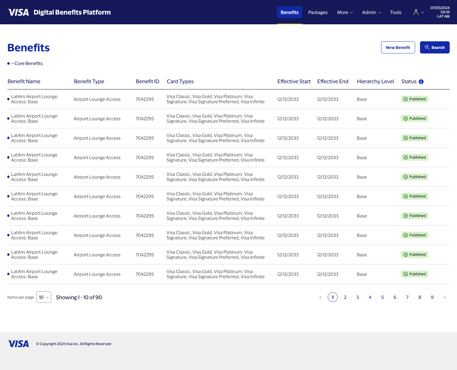
Benefits menu — table + pagination shell 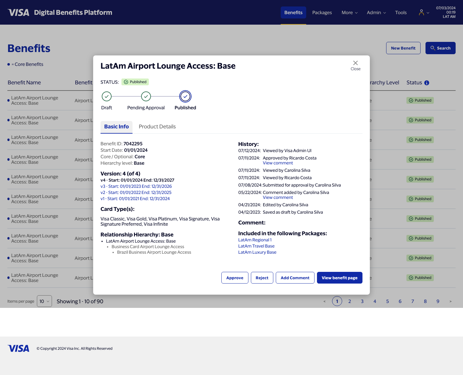
Row-click overlay — Basic Info tab -
2
Base benefit page
Builtbenefit.html · benefit.css
The full parent — Base — benefit page in Published, view-only mode: status wizard, the persistent 370px sidebar with scroll-to-section navigation, and every content section from the spec — Basics, Card Types & Budget, Non-Effective Dated Changes, Attachments, Additional Language Support. "View benefit page" from the overlay lands here.
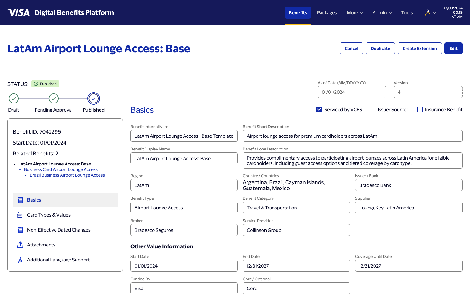
LatAm Airport Lounge Access: Base — published, view-only -
3
Hierarchy, live editing & validation
Builtshared.js · menu.js · benefit.js · data.js
The headline feature — Create Extension — grew into the largest session by far: turning a static page into one that holds up under real interaction, then giving it real data and real validation.
- Create Extension clones the Base into a child (Ext. Lvl 1) benefit in Unsaved Draft state: same data, a new 7-digit ID, the page title suffixed, and the sidebar's Related Benefits hierarchy and count updated to reflect it.
- The logic file was split into
shared.js(store, hierarchy helpers, view routing),menu.js, andbenefit.jsonce the interaction surface got large enough to need it, per the plan's own instruction to do this split in Session 3. - Every field became a live, editable input bound to a path in the benefit record, with deferred re-rendering so a keystroke doesn't fight its own DOM update.
- The Add New Tier modal was built to a Figma node that, on inspection, didn't match what it had been described as containing — flagged rather than guessed at, and rebuilt against the corrected node once supplied, including a rollback path so cancelling never leaves an orphaned Coverage row behind.
- Required-field validation: ~20 fields marked with an asterisk across Basics and Card Types & Budget, plus a minimum-one-Tier rule per group. Submitting with anything missing shows a sticky banner with a live count and marks every offending field — red outline, red label, red message — without disturbing Save Draft, which stays allowed to hold incomplete work on purpose. The same treatment was retrofitted onto the Add New Tier modal, which had been failing silently.
- Real dropdown data replaced the last placeholder option lists ("One, Two, Three, Four") across seven fields, consolidating duplicates into shared lists instead of keeping near-identical copies — Billed To, Entity to Bill, and Funded By all draw from one funding-entity list; Cost row and Non-Effective Dated Changes Billing Options share another.
- Additional Language Support's second tab went from a dead placeholder to a real button that adds a blank Português/Español entry; Attachments gained FAQs and Product Brochure / Flyer as upload-prompt tiles, visible only in edit mode; the sidebar now lists a "Group N" sub-item for each Card Types & Budget group, added and removed live as groups change.
- Several real bugs, root-caused rather than patched: a multiselect dropdown that wouldn't reliably close on an outside click (competing re-renders racing each other); chevron/calendar icons that looked clickable but weren't (padding reserved for the icon lived on the wrong element); date fields silently dropping keystrokes while editing an existing value (a full re-render was firing on nearly every keystroke, same class of mistake as the multiselect bug but a different trigger); view-mode multiselect fields losing their bordered box entirely; error messages breaking a row's alignment because the field's border didn't expand to contain them; and three checkboxes (Serviced by VCES, Issuer Sourced, Insurance Benefit) silently reverting on submit because they'd never been wired to the data model at all.
- Later cleanup passes: a delete affordance on Cost rows, Coverage's Currency dropdown removed and its Remove button pulled inline, Coverage Type defaulted to "Spend-based" and moved to the top of its list, independent backgrounds for each Card Types & Budget group with one de-duplicated "+ Add" button, and the unused Global/Hurdle/MCG summary row removed from Qualification.
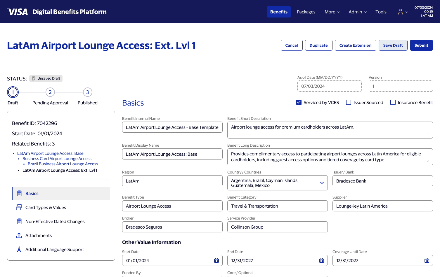
Create Extension — Ext. Lvl 1, Unsaved Draft 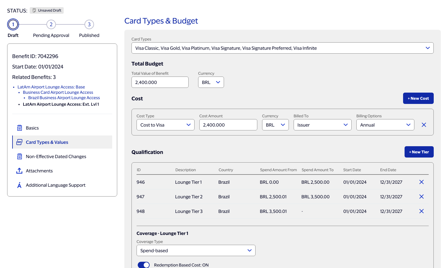
Card Types & Budget — edit mode 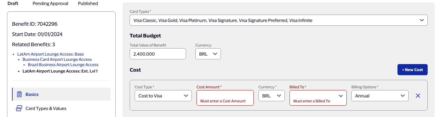
Required-field validation — errors contained inside each field's own border 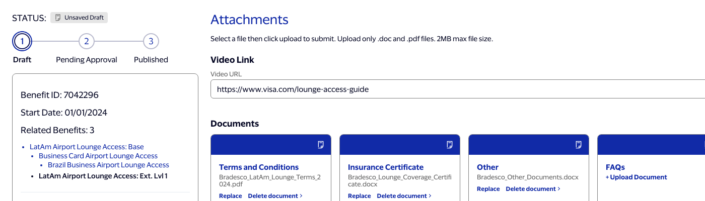
Attachments — FAQs / Product Brochure upload prompts, edit mode only 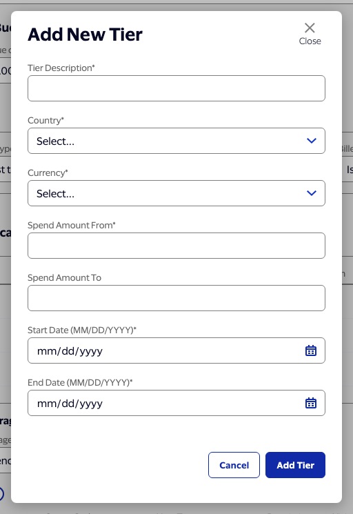
Add New Tier — modal, built to a corrected Figma node 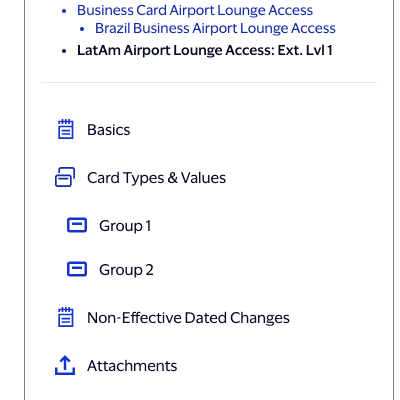
Sidebar — Group N sub-nav, one per Card Types & Budget group -
4
Blank benefits, editable parents & document upload
Builtshared.js · data.js · benefit.js · benefit.html · benefit.css
The literal scope — a blank New Benefit page — turned out to be the smallest part of it once editing an already-published benefit and a full document upload workflow got folded in.
- New Benefit now builds a genuinely blank benefit — every Basics field empty, a fresh random 7-digit ID, Unsaved Draft — with one blank Card Types & Budget group present from the start rather than an empty section the user has to click into existence. Every dropdown that starts empty (Currency, Funded By, Core/Optional) shows a real "Select..." placeholder instead of silently defaulting to whatever option happened to be first in its list.
- Edit now actually works on a Published, Pending Approval, Rejected, or Expired benefit — a button that had no click handler at all until this session. The status badge and wizard keep showing the real status throughout the edit; Submit correctly moves it to Pending Approval and drops back to view-only by default afterward, matching the spec's own rule for that status. Cancel needed zero new code — it already discarded any in-progress edits for free, since it just navigates away without ever writing to storage.
- Two bugs that predated this session, found while testing the above: Benefit Category had been silently rendering as a plain text field since early in the build, even though the real 11-category CLAUDE.md list already existed in
data.js, just never wired up; and creating an extension from an extension doubled the name ("...Ext. Lvl 1: Ext. Lvl 1") because hierarchy level was hardcoded to always resolve to "Ext Lvl 1" and the name-suffix stripping only recognized ": Base". Generalized to handle Base → Ext Lvl 1 → Ext Lvl 2 correctly, and Create Extension now correctly disappears on a grandchild page, per the spec's own rule that extensions can't go a level deeper than that. - Document upload: a three-state overlay (select a name → "Upload in progress..." → success) built from three separate Figma nodes, with a 0.2s crossfade between states and a 1.2s hold on the uploading state. Wired to both "+ Upload Document" (blank) and "Replace" (pre-filled with the current name) on any of the five fixed document categories. "Delete" now clears the filename rather than removing the slot, so all five categories stay present in edit mode and only the named ones show in view mode. Every additional language's own document list is kept in sync automatically — gaining or losing a category the instant it's named or cleared in the main Attachments list, recomputed fresh on every render rather than manually threaded through each individual upload/replace/delete action.
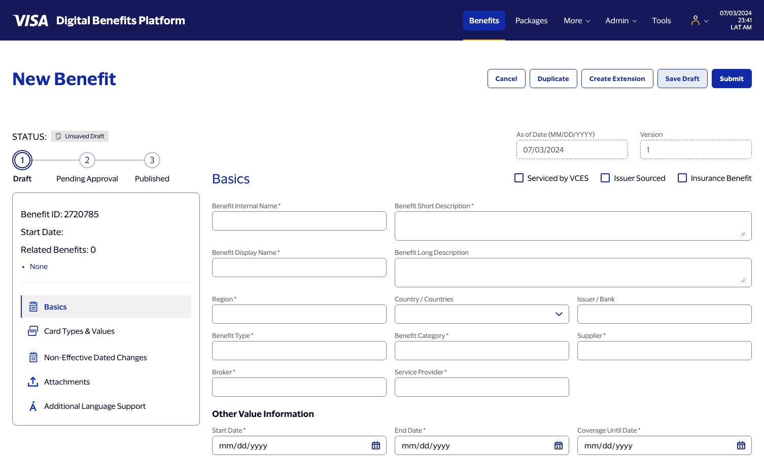
New Benefit — genuinely blank, one Card Types & Budget group present from the start 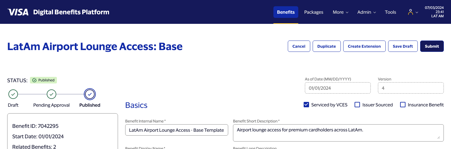
Edit toggle — status stays Published while fields become editable 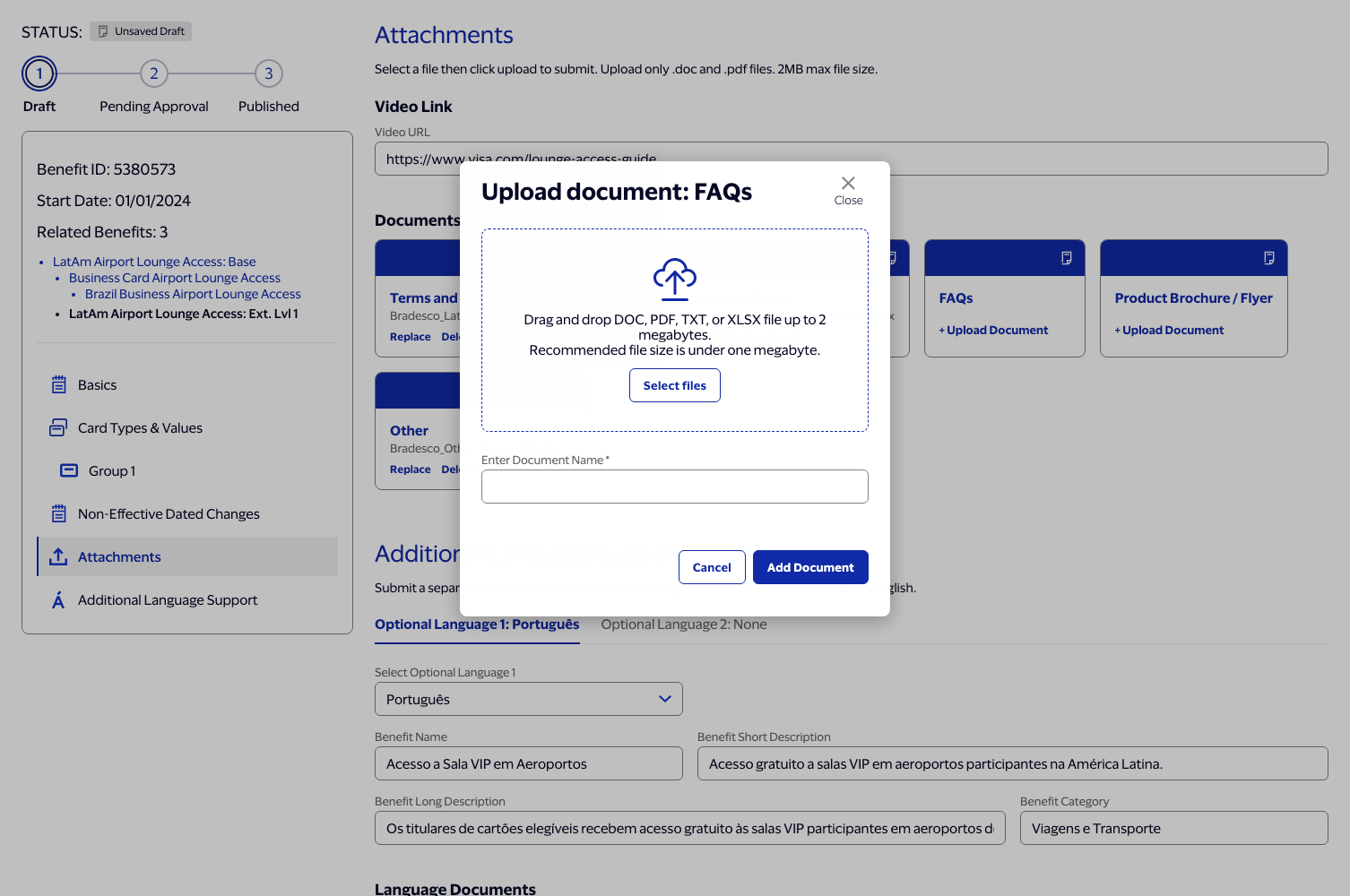
Document upload — select state, built from three Figma nodes 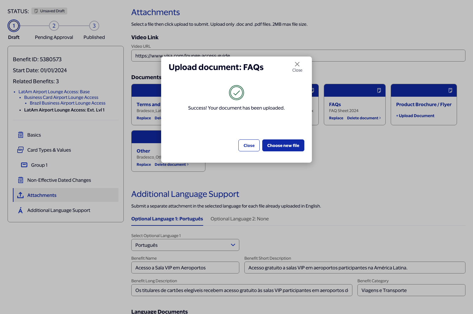
Document upload — success state, after a 0.2s crossfade and 1.2s hold on "uploading" -
5
Unique benefit data across the menu
Builtdata.js · menu.js
Every row across the Benefits menu's full run of pages now carries its own realistic Bradesco-context record — a distinct name, benefit type, ID, card-type assignment, hierarchy level, status, and pair of effective dates — rather than one shared placeholder repeated down the table.
- Status and date logic follows an explicit rule set rather than being picked freely: Pending Approval rows always start after today's date (07/04/2026); Expired rows always ended on or before 07/05/2026; everything else reads as currently live, with its end date still ahead. Unsaved Draft is deliberately never used here — an unsaved draft is destroyed the moment its editor navigates away, so by definition it could never survive to appear in a menu.
- A style pass, prompted by review: the first working version had every page's Published badges clustered at the top of the table. Reordered so status reads as a naturally occurring mix on every page, not a sorted block.
- A second pass, also prompted by review, gives the menu's later pages their own distinct row ordering rather than reading as an obvious echo of the earlier ones — a small seeded shuffle keyed to the page number, so a given page's order is fixed and identical every time it's revisited, but different from every other page's.
- Fixed a real, previously invisible pagination bug surfaced while wiring this up: clicking a page number updated the pager control itself but never actually re-rendered the table underneath it —
goToPage()was callingrenderPagination()but notrenderBenefitRows(). - Every row still opens a working detail overlay on click; the overlay's own content becomes unique to each benefit in Session 6.
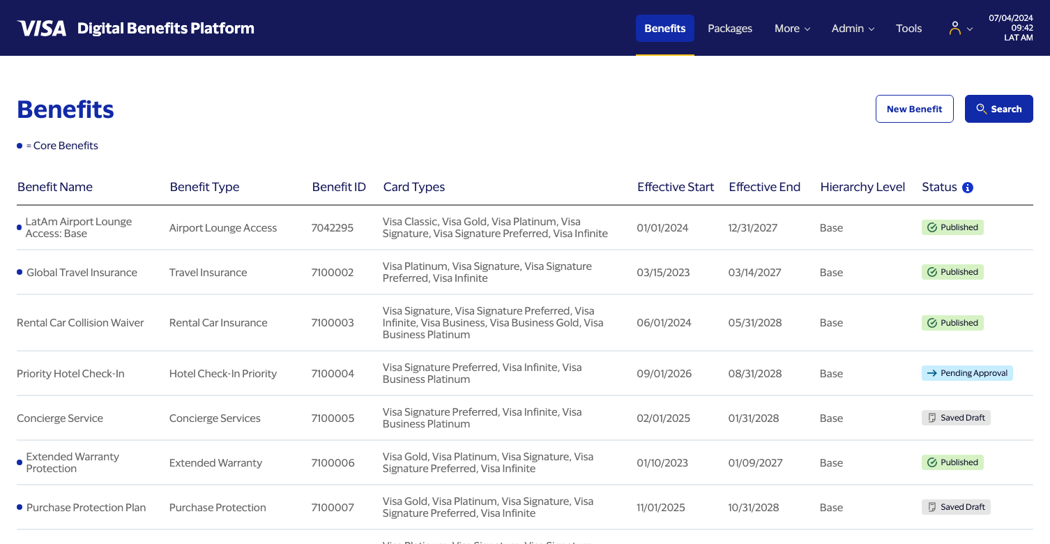
Benefits menu — page 1, statuses reading as a natural mix 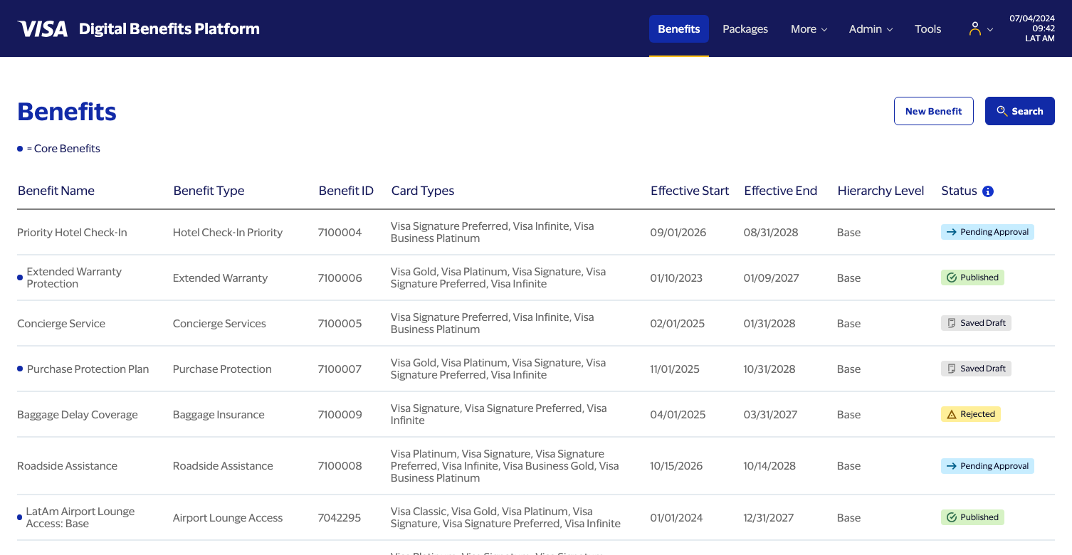
Benefits menu — page 4, its own independent ordering -
6
Unique overlays, real hierarchy & Approve / Reject / Comment
Builtdata.js · shared.js · menu.js · menu.css · index.html
Scoped as "give every overlay its own data" and grew into the session that made hierarchy, and the decision workflow around it, actually real — a mid-session redirect: rather than independent benefits with invented Basic Info content, several of them were redesigned into genuine Base → Ext Lvl 1 → Ext Lvl 2 families, and Approve / Reject / Add Comment went from static buttons to a working decision loop.
- Every benefit in the menu now carries its own real overlay data — version history, an interaction history with occasional comments, and package assignments — instead of silently inheriting the flagship's unrelated content through the placeholder-spread mechanism. Comments are always present on a Rejected entry (a rejection needs a stated reason) and occasional on an approval; most history lines carry none.
- Real hierarchy families, not just Base records: a good number of them now form actual Base → Child → Grandchild trees and sibling sets — LatAm Airport Lounge and Grocery Cashback each grow a full three-generation line, Global Travel Insurance and Fuel Discount Program each grow sibling Ext Lvl 1 children (Fuel Discount's Business Fleet child has its own grandchild besides). Building this meant retiring some of Session 5's standalone concepts to make room for the new family members.
- A real bug found while wiring the schematic up: the "Relationship Hierarchy" tree is supposed to always root at the ultimate Base, but a grandchild's root label was actually pulled from its immediate parent's name — invisible for a two-generation family, wrong the moment a third generation existed. Fixed by tracking
baseBenefitNamethe same waybaseBenefitIdalready was, rather than reusing the immediate-parent field. - Two more fixes, caught in review: the schematic's currently-viewed benefit is now medium-weight at whatever depth it actually sits at (previously only the root ever read as emphasized, regardless of which benefit was open) — and along the way, giving the current node real weight surfaced a second bug for free, since font-weight inherits: a current Base's 500-weight was bleeding down onto its own non-current children until the child tree got its own explicit baseline. Separately, interaction history now sorts newest-first via a real stable date sort rather than array order, since the flagship's original data was already newest-first while every new record had been authored oldest-first — a blind reverse would have fixed one and broken the other.
- Product Details tab, populated across the board: a tier table per benefit (random 3-digit tier IDs, names generated from the benefit's own type so "Fuel Rewards Tier 1" always reads as fuel-related), costs at two decimal places throughout — including a retroactive fix to the flagship's own pre-existing three-decimal figures — and real currency variety: mostly BRL, with the Cayman Islands, Guatemala, Mexico, and Argentina family members priced in their own implied currency instead of defaulting everything to Brazil.
- Approve, Reject, and Add Comment now work, built from two Figma nodes: a shared modal (icon, title, and required-ness swapped by mode) that stacks above the still-open detail overlay, with its own shade dimming the first overlay too. Approve/Reject only appear on a benefit actually in Pending Approval — everywhere else, the path forward is edit-and-resubmit, not re-deciding it from the menu. Comment is required for Add Comment, optional for Approve/Reject, capped at 400 characters. Submitting pushes a real history entry (with a "View comment" link if text was entered) and, for Approve/Reject, changes the benefit's status live in the still-open overlay — no need to close and reopen.
- The change persists: reopening the overlay, or reloading the page outright, still shows the decision. Built on a new
getBenefitOverride/saveBenefitOverridesessionStorage pair inshared.js, mirroring the store Session 3 built for Create Extension, checked by the menu's row-building function before every render. Written as a standalone helper on purpose, so Session 7's benefit-page loader can call the exact same function and a decision made from the menu today will already be correct on that benefit's real page once it exists. - A second real bug, caught testing the above: a freshly-submitted decision was sorting into the middle of a benefit's history instead of on top. The new entry's timestamp was using the same helper the topnav clock uses, which deliberately hardcodes the year to 2024 per spec — colliding with the 2026-dated "today" this build has used for status logic since Session 5. Fixed with a dedicated
getBusinessToday()helper, and applied retroactively to the two pre-existing spots with the same root cause (Create Extension's and New Benefit's own "Created" timestamps).
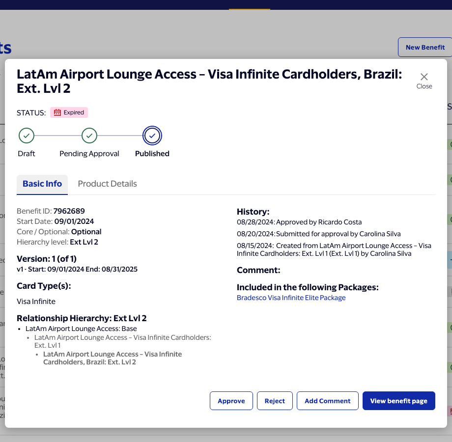
Grandchild overlay — schematic rooted at Base, current node bolded, history newest-first 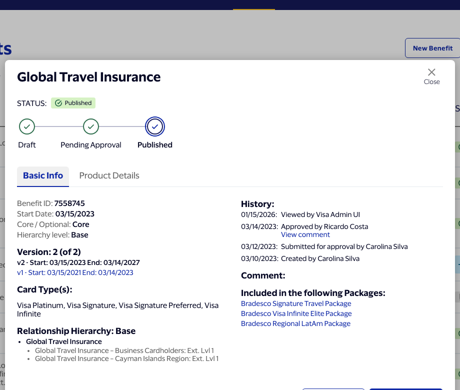
Base with sibling children — Global Travel Insurance's two Ext Lvl 1 variants 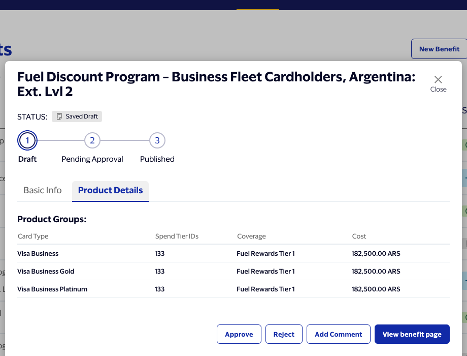
Product Details — Argentina family member, priced in ARS 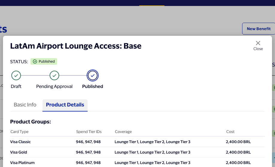
Flagship's own cost figures, retroactively fixed to two decimals 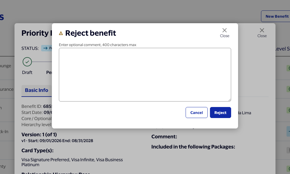
Reject modal — stacked above the detail overlay, built from the Figma node 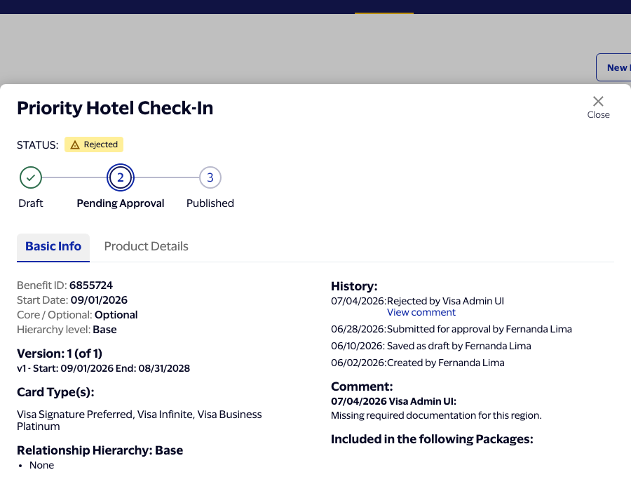
After Reject — badge, wizard, history, and comment all update live -
7
Unique benefit pages, derived rather than hand-authored
Builtshared.js · data.js · common.css · benefit.js · benefit.css
Scoped deliberately low-effort going in, on the reasoning that most of what a full page needs was already sitting in Sessions 5–6's overlay data. Rather than hand-authoring another dataset per benefit, one derive function synthesizes each page's remaining sections from data already on hand, run once at "View Benefit Page" time.
deriveFullBenefitPage()builds Card Types & Budget straight from that benefit's existing Product Details tier data — same tier IDs, names, cost, and currency, just reshaped into the page's format — and derives Benefit Category from the benefit's own type, Country from the currency it's already priced in, and Supplier/Broker/Service Provider/Funded By from small pools seeded by benefit ID so a given benefit always shows the same picks. Skipped entirely for the flagship (already real, hand-authored data) and for a blank New Benefit (nothing to derive from yet).data.jsitself is untouched — no new bulk data to write or review.- Create Extension needed zero changes: it already deep-clones whatever benefit object it's given, so a child correctly inherits its parent's derived page content the same way it already inherits everything else.
- A real bug caught in testing: every derived page showed the flagship's name in its Internal Name and Display Name fields. The fallback
benefit.internalName || benefit.benefitNameassumed a missing name would be falsy, but it was never actually missing — every menu row inherits the flagship's fields by default through the overlay's placeholder-spread mechanism, so the fallback never fired. Fixed to set both unconditionally from the benefit's real name. - A layout bug, flagged with a screenshot: a long benefit name pushed into the action buttons and compressed them, wrapping "Create Extension" and "Save Draft" onto two lines inside their own buttons. Neither the title nor the actions row had a width constraint, so flexbox shrank both together. Fixed by capping the title's width so it wraps to a second line sooner, and marking the actions row
flex-shrink: 0so it never shrinks at all. - Two more bugs, found testing Additional Language Support specifically: a benefit could be submitted for approval with a newly-added language's documents never actually uploaded, because nothing checked that they were. Added a validation rule — every document already uploaded in the main Attachments list must also be uploaded for each language actually in use — reusing the existing red-outline-plus-toast pattern rather than inventing a new one; Save Draft stays exempt, same as every other required-field rule. Separately, Optional Language 1's fields were invisible until "+ Add Language" was clicked once; changed the default so one blank language slot is always present and visible, with a second slot only offered once the first is actually filled in.

Title/actions layout fix — buttons stay full width, title wraps sooner 
Derived Basics — country and category follow the benefit's own data 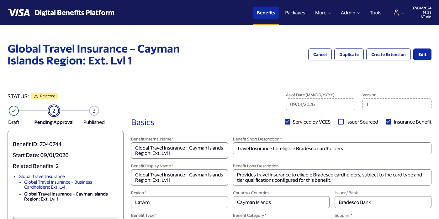
Derived Card Types & Budget — same tier data as the overlay, reshaped 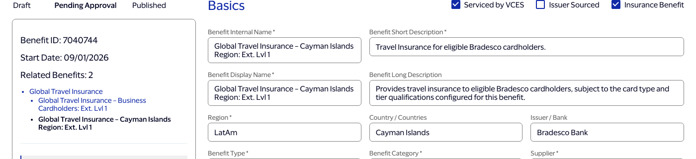
Internal/Display Name fix — no longer showing the flagship's name 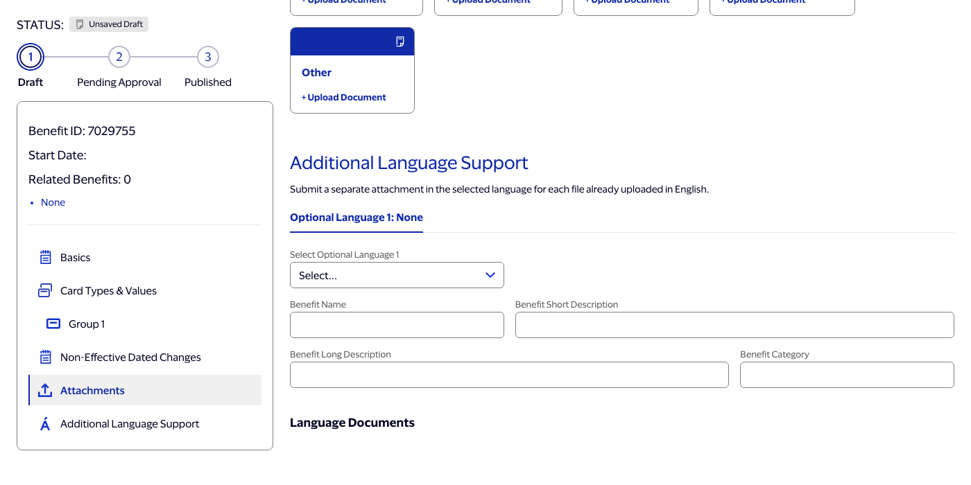
Optional Language 1 — always visible, no click required 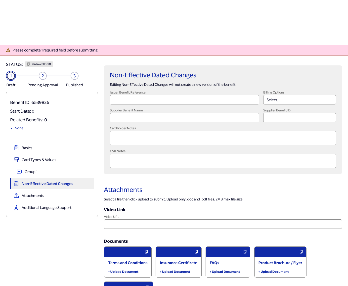
Submit correctly blocked on an unuploaded language document -
8
Open
PlannedScope TBD
Reserved for whatever comes after the core seven. Error and validation states — originally the first candidate for this slot — ended up landing inside Session 3 instead, once it became clear they belonged with the rest of the interactive-editing work rather than as a separate pass. Nothing specific is scoped here yet.
How this got built
A few habits carried through the whole build, worth naming because they're the part that doesn't show up in a screenshot.
-
Verify in the browser, not on paper
Every UI change was driven through an actual Playwright session — click the row, open the overlay, enter edit mode — rather than reported done because the code looked right. The multiselect and chevron bugs above were both found this way; neither was visible from reading the source.
-
Flag the spec, don't guess it
When a linked Figma node didn't contain a field it was described as having, the mismatch got raised as a question rather than resolved by assumption — the same standard applied to a tool result mid-session that looked like it had picked up an unrelated, possibly injected instruction; it was called out and set aside rather than acted on.
-
Corrections land as rules, not one-offs
Specific asks — narrow the Currency field to make room for a delete icon, move Coverage's Remove button inline, drop the non-functional search row from both multiselects, default Coverage Type to Spend-based and put it first in its list — were treated as standing decisions for the pattern, not fixes to one screen.
-
Ambiguity gets a real decision, not a coin flip
Where the spec was genuinely silent — how far a currency field should shrink, whether a Remove button sits inline or on its own row — the choice was surfaced explicitly with options, not picked silently and revealed later in a screenshot.
-
This page is one of those decisions
Sessions 1 and 2 are summarized here from the finished code, because that's the level of detail actually available for them — there was no running log at the time. Starting from Session 3 onward, this page gets updated alongside the build itself, so nothing has to be reconstructed from memory again.
-
Permissions scoped narrowly, not broadly
Asked to cut down on repeated approval prompts, the fix was a project-level allowlist covering exactly what verification actually touches — editing the app's own HTML/JS/CSS and a few named folders, running the local test server, curling only
localhost, running node scripts — not a blanket "stop asking" for anything. Everything outside that scope still prompts, same as before.
Where it stands
A working prototype covering the full Base → Extension hierarchy — creatable from scratch, editable at any status, validated, with real document upload — a Benefits menu fully populated with unique, realistic, and genuinely hierarchical records, each with its own real overlay and full page, and a real Approve / Reject / Comment decision loop with changes that persist across reopening the overlay, reloading the page, or navigating to that benefit's own page. Not yet real: actual file storage behind the upload overlay (it's a real interaction, just not a real file system), and translated content for an added language beyond the flagship's own example (the upload/validation workflow around it is fully real either way).
| Area | State |
|---|---|
| Benefits menu, pagination | Built — unique, partly hierarchical benefit data across every page |
| Detail overlay (Basic Info + Product Details) | Built — unique data across the menu, including real Base/Ext Lvl 1/Ext Lvl 2 families |
| Approve / Reject / Add Comment | Built — persists across reopen, reload, and onto that benefit's own page |
| Unique benefit pages | Built — full-page content derived from each benefit's own overlay data |
| Create Extension → child hierarchy | Built, correct through Base → Ext Lvl 1 → Ext Lvl 2 |
| Add New Tier | Built, with cancel-safe rollback |
| Required-field validation | Built — banner, per-field errors, Submit-only, including per-language document completeness |
| Dropdown option data | Built — no placeholder options remaining |
| Additional Language Support | Built — Optional Language 1 always visible; Português / Español; second slot on demand |
| Sidebar Group N navigation | Built, updates live as groups are added or removed |
| New Benefit → blank page | Built — one blank Card Types & Budget group present from the start |
| Edit on Published / Pending / Rejected / Expired | Built — status stays real, fields become editable |
| Document upload (select / uploading / success) | Built — Upload, Replace, and Delete all wired; language documents auto-sync |
| Package menu, packages, package pages | Explicitly out of scope for this phase |