VISA DIGITAL BENEFITS PLATFORM • SYSTEM DESIGN FOR CONFIGURATION OF CARD BENEFITS
THE ONE THING TO KNOW FIRST
Visa doesn't decide what a cardholder's benefits are — the issuing bank does. A bank like Bradesco configures that through the Visa Digital Benefits Platform (VDBP): build a Benefit (airport lounge access, purchase protection, a concierge line), group benefits into a Package, then assign packages to BINs — the digit ranges printed on the card — which is the actual mechanism that hands a cardholder access to what's inside. Everything below is really about making that one workflow trustworthy at scale, for banks processing thousands of regional and tier variations at once.
Role: Lead UX Designer • Timeline: September 2022 – February 2023, three phases • Users: issuing-bank admins (Bradesco, BBVA, and others) working in a live production system
Problem: no hierarchy — every regional or tier variation required an entirely new benefit record, duplicated across a growing, unnavigable library
Solution: a Base/Extension inheritance model, decision-ready menus, quick-view overlays, and guardrails designed to make the system harder to break, not just easier to use
▶ VIEW LIVE PROTOTYPE ▶ GITHUB REPOSITORY ▶ BUILD-LOG
PROJECT BRIEF
When I joined the project, the system had a foundational problem: no organizational structure. Every variation of a benefit had to be built from scratch as its own record. Over time, the benefits library had become an unnavigable pile — teams at issuing banks like Bradesco were slowing down, making errors, and losing confidence in the system.
My role was to design a way out of that. The critical constraint: we couldn't start over. The system was already in production. Issuing bank teams at major global banks — Bradesco, BBVA, and others — used it daily. They knew its quirks, had built workflows around it, and couldn't afford retraining on an entirely new product. The new features had to feel like natural extensions of what they already knew, not a replacement.
WHY THIS PROJECT MATTERS
Benefits configuration sits at the intersection of policy, money, and operational risk. A misconfigured benefit isn't an abstract UX failure—it can break cardholder entitlements across an entire region. That reality shaped every design decision: the goal wasn't just to make the system easier to use, it was to make it harder to break.
Where I started
Before any design decisions, I had to understand the system deeply enough to redesign it responsibly. VDBP was already in production — real banks, real cardholders, real consequences for errors. That meant discovery had to be rigorous: not just what users wanted, but what the system actually did, what could safely change, and what couldn't.
I ran workshops with the product team, conducted research through a UX research partner, and mapped the system from the ground up — documenting what existed, what was broken, and what the design needed to preserve even as it improved. All of that thinking lived in FigJam before it ever touched Figma.
Understanding what the system actually does
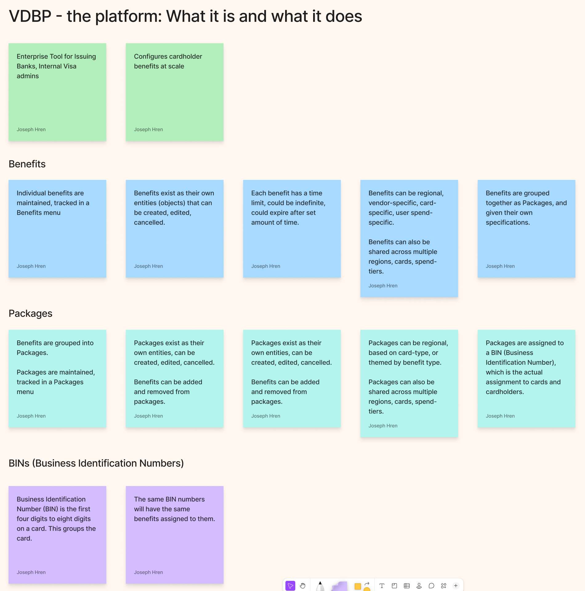
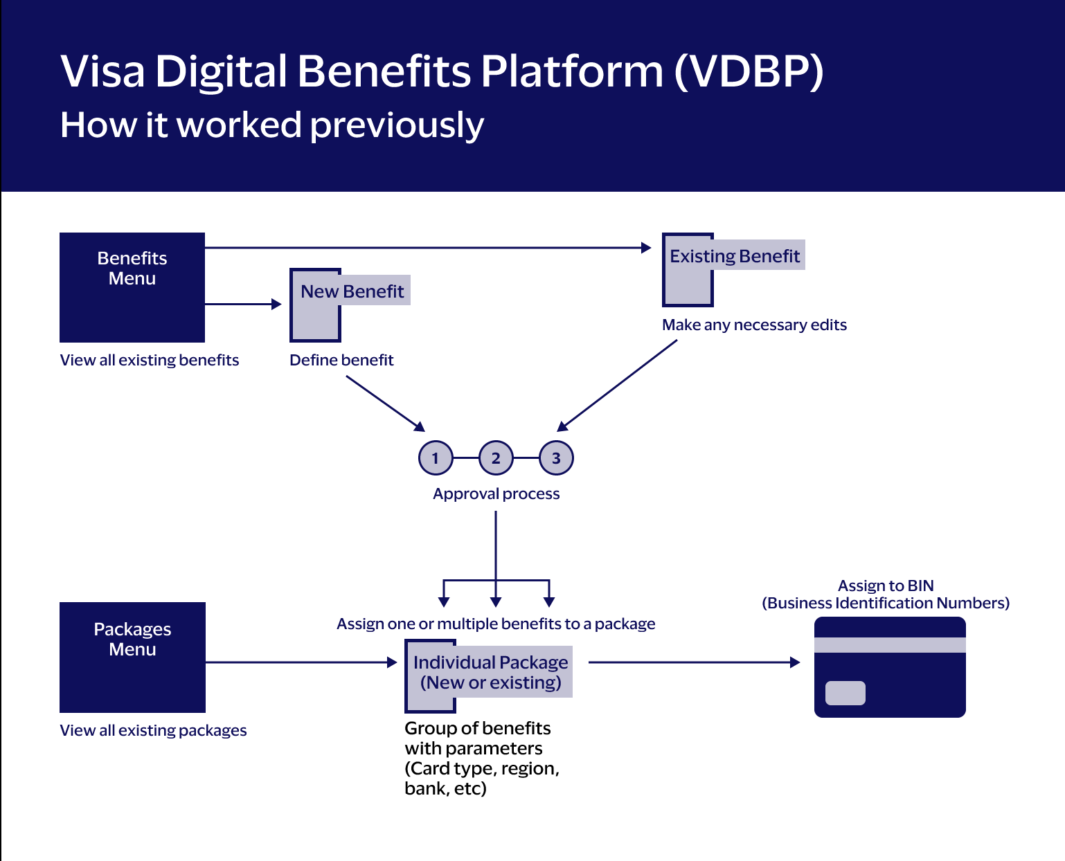
The first thing I needed was a shared, definitive answer to a deceptively hard question: what is VDBP, exactly? The answer turned out to be more complex than anyone had written down.
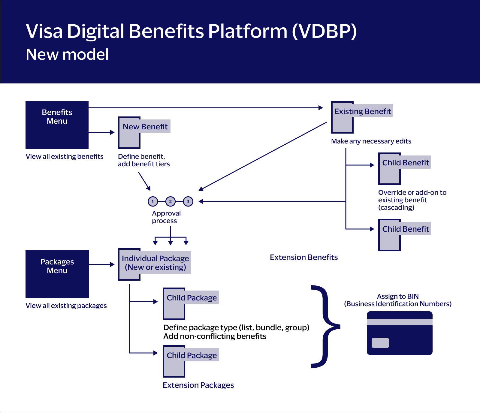
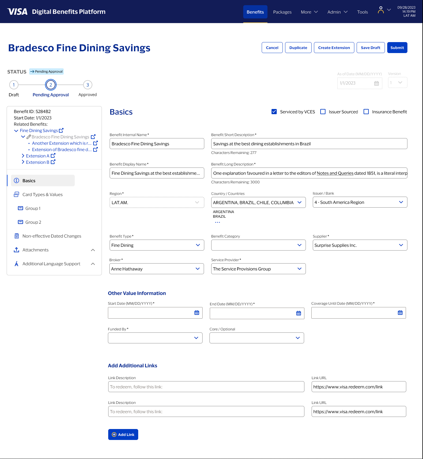
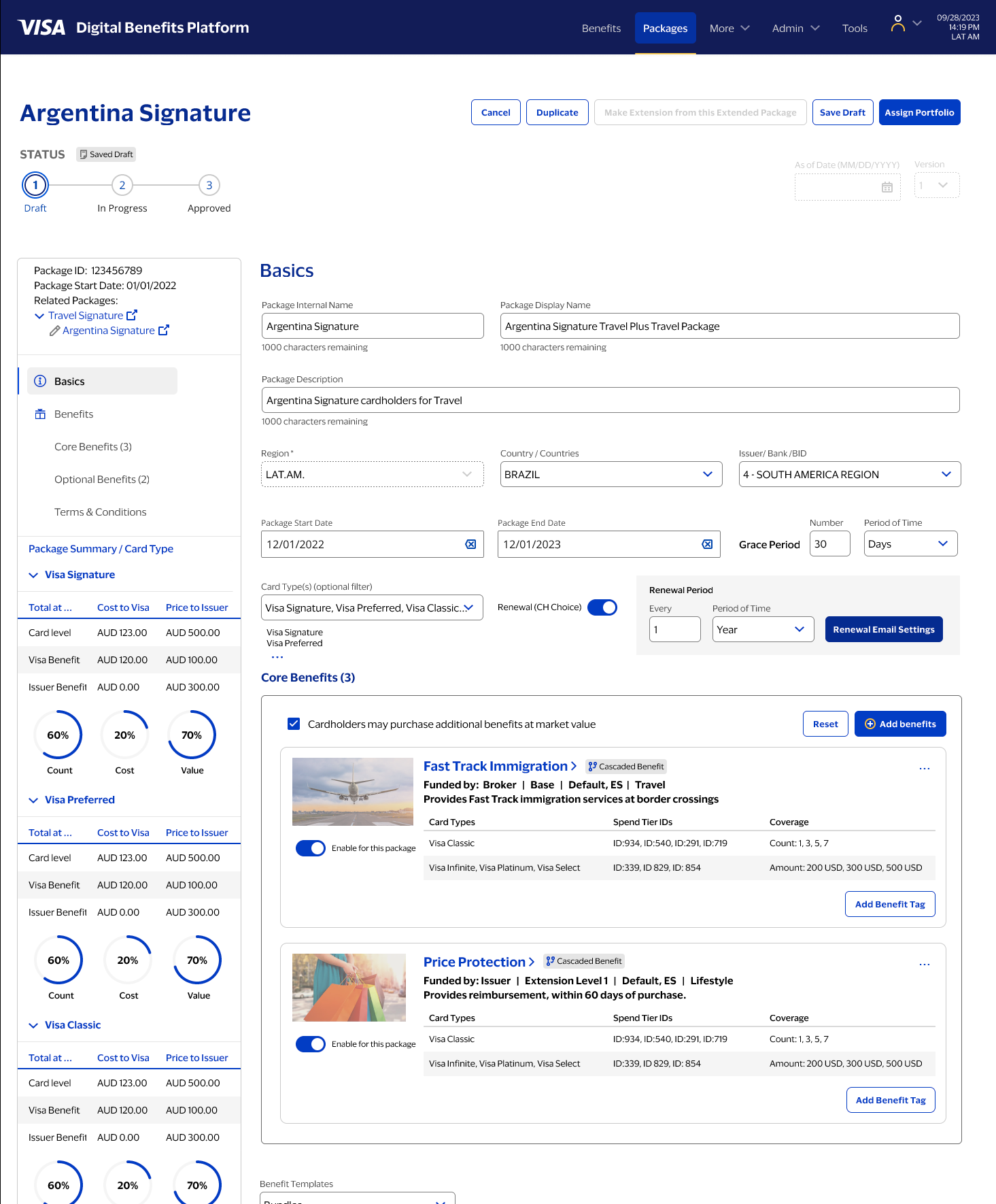
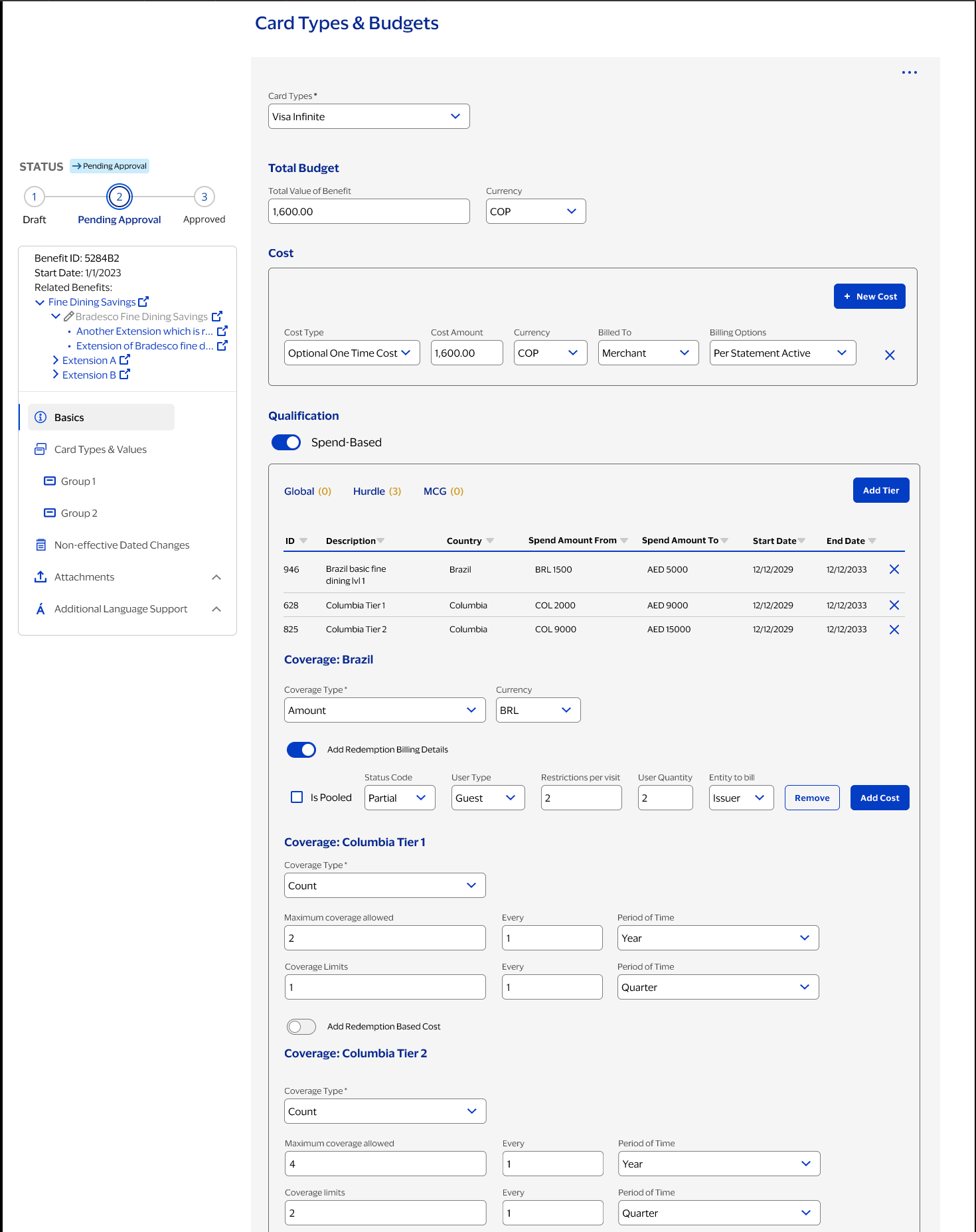
VDBP is an enterprise configuration tool. Issuing banks use it to define cardholder benefits — what a benefit covers, who qualifies, when it expires, how much it costs, which regions it applies to, and which card products carry it. Benefits are grouped into Packages. Packages are assigned to BINs — Business Identification Numbers, the first four to eight digits of a card number — which is the actual mechanism that connects a benefit to a cardholder.
Every benefit and package is its own distinct object in the system, with its own lifecycle: created, configured, submitted for approval, approved or rejected, published, and eventually expired or replaced. That lifecycle — and the relationships between objects — was the design surface I had to work with.
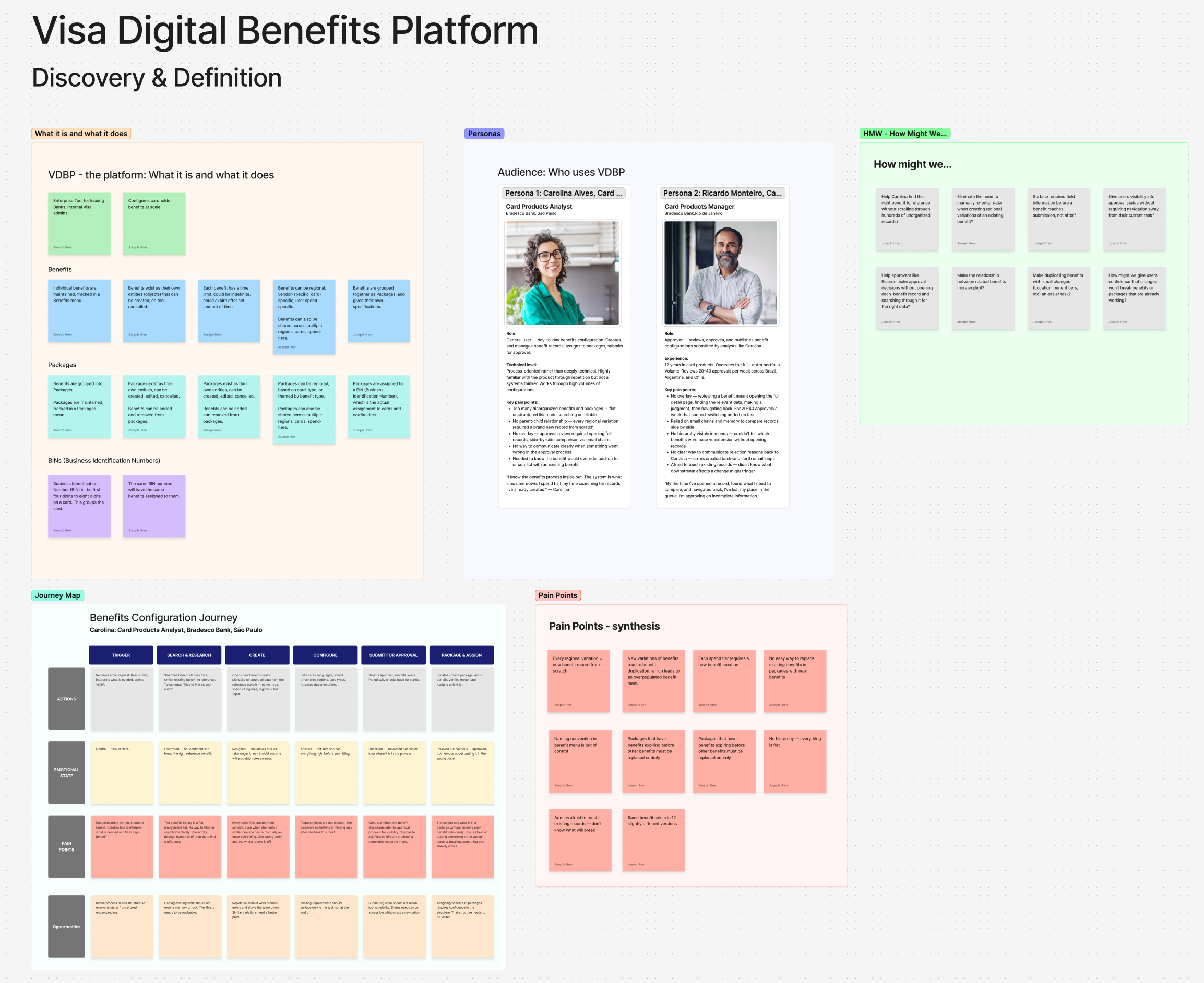
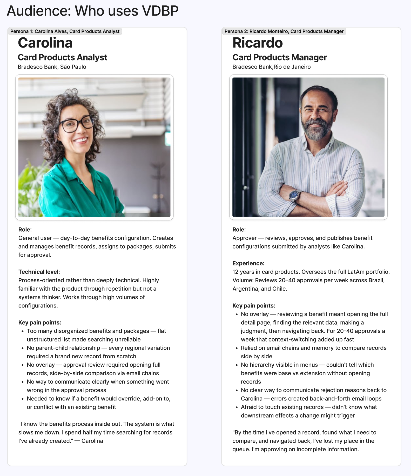
Who uses it — and how differently they think
Two personas emerged from research, and their needs were in productive tension with each other.
Carolina is a Card Products Analyst at Bradesco Bank in São Paulo. She's process-oriented, not deeply technical. She creates and manages benefit records daily — searching for references, configuring attributes, submitting for approval. Her frustration: the system made routine work unpredictable. "I know the benefits process inside out. The system is what slows me down. I spend half my time searching for records I've already created."
Ricardo is a Card Products Manager, also at Bradesco, overseeing the full LatAm portfolio from Rio de Janeiro. He reviews 20-40 benefit approvals per week. His frustration: every approval required opening the full record, navigating away from the queue, and relying on memory to compare. "By the time I've opened a record, found what I need to compare, and navigated back, I've lost my place in the queue. I'm approving on incomplete information."
Carolina needed a system that made creation faster and less error-prone. Ricardo needed a system that let him evaluate records without losing context. Both needed to trust that changes they made wouldn't quietly break something downstream.
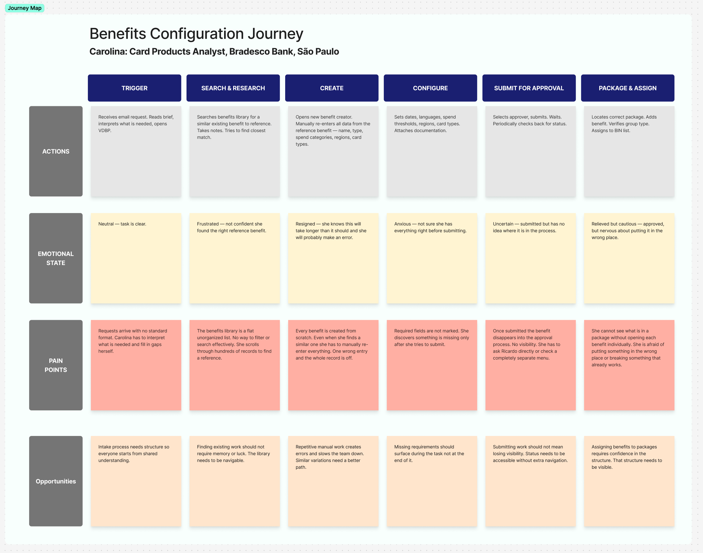
Mapping the journey — and where it broke
I mapped Carolina's full configuration journey across six stages: Trigger, Search & Research, Create, Configure, Submit for Approval, and Package & Assign. At every stage I documented her actions, emotional state, pain points, and design opportunities.
The emotional arc was the real finding: Carolina started neutral, became frustrated during search, resigned herself to making errors during creation, grew anxious at configuration, and felt uncertain at submission. She was relieved when approved — but immediately nervous about putting the benefit in the wrong place. Not one stage in the journey produced confidence.
That arc became the design brief. Every solution had to address a specific stage in that journey and move the emotional state in the right direction.
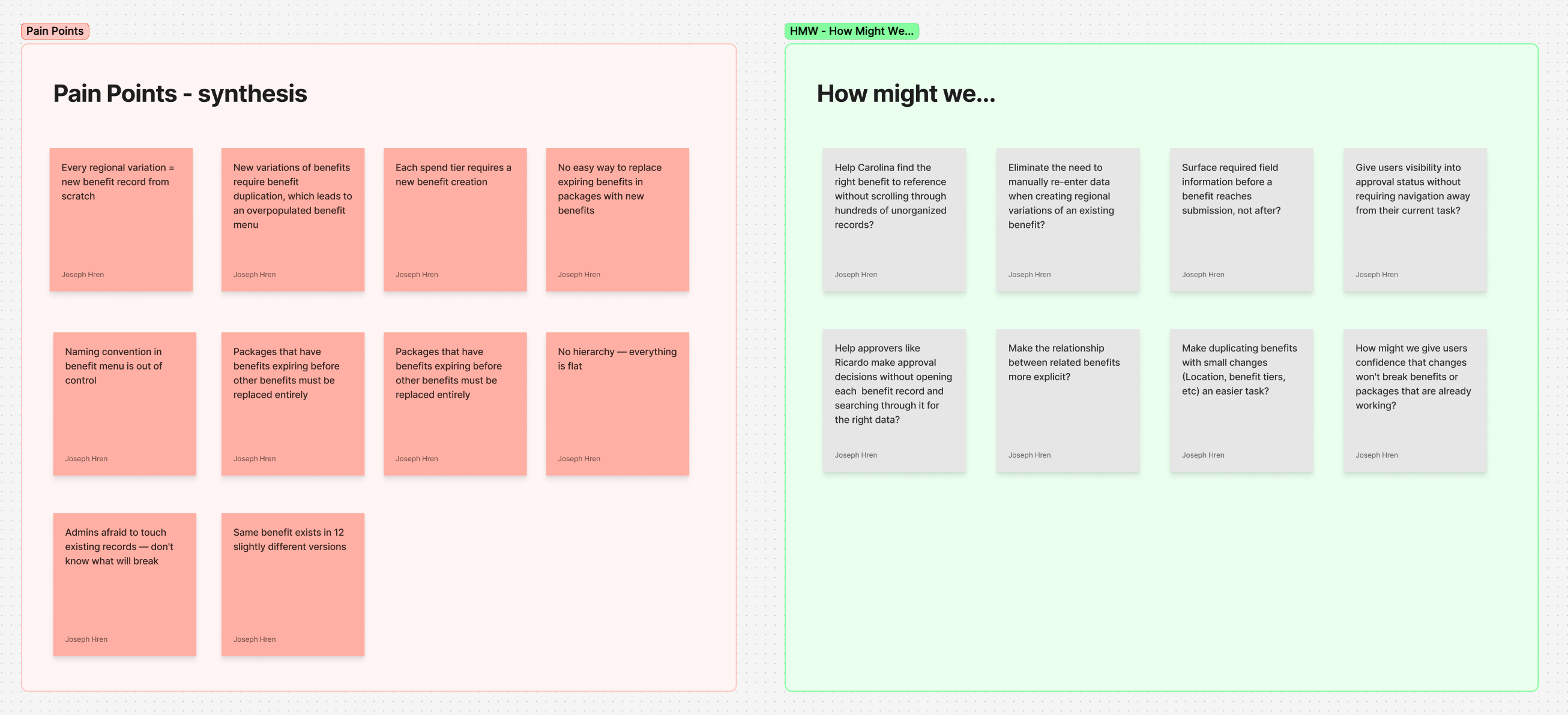
Synthesizing pain points into design questions
From research and the journey map, I synthesized ten core pain points — the specific, concrete failures in the current system that the redesign needed to fix. Then I translated each into a "How Might We" question, reframing every problem as a design opportunity.
The pain points ranged from structural ("no hierarchy — everything is a flat list") to procedural ("admins afraid to touch existing records — don't know what will break") to interpersonal ("no clear way to communicate rejection reasons back to Carolina — errors created back-and-forth email loops"). The HMW questions that came from them shaped the solution framework directly: they became the design brief that the new features were measured against.
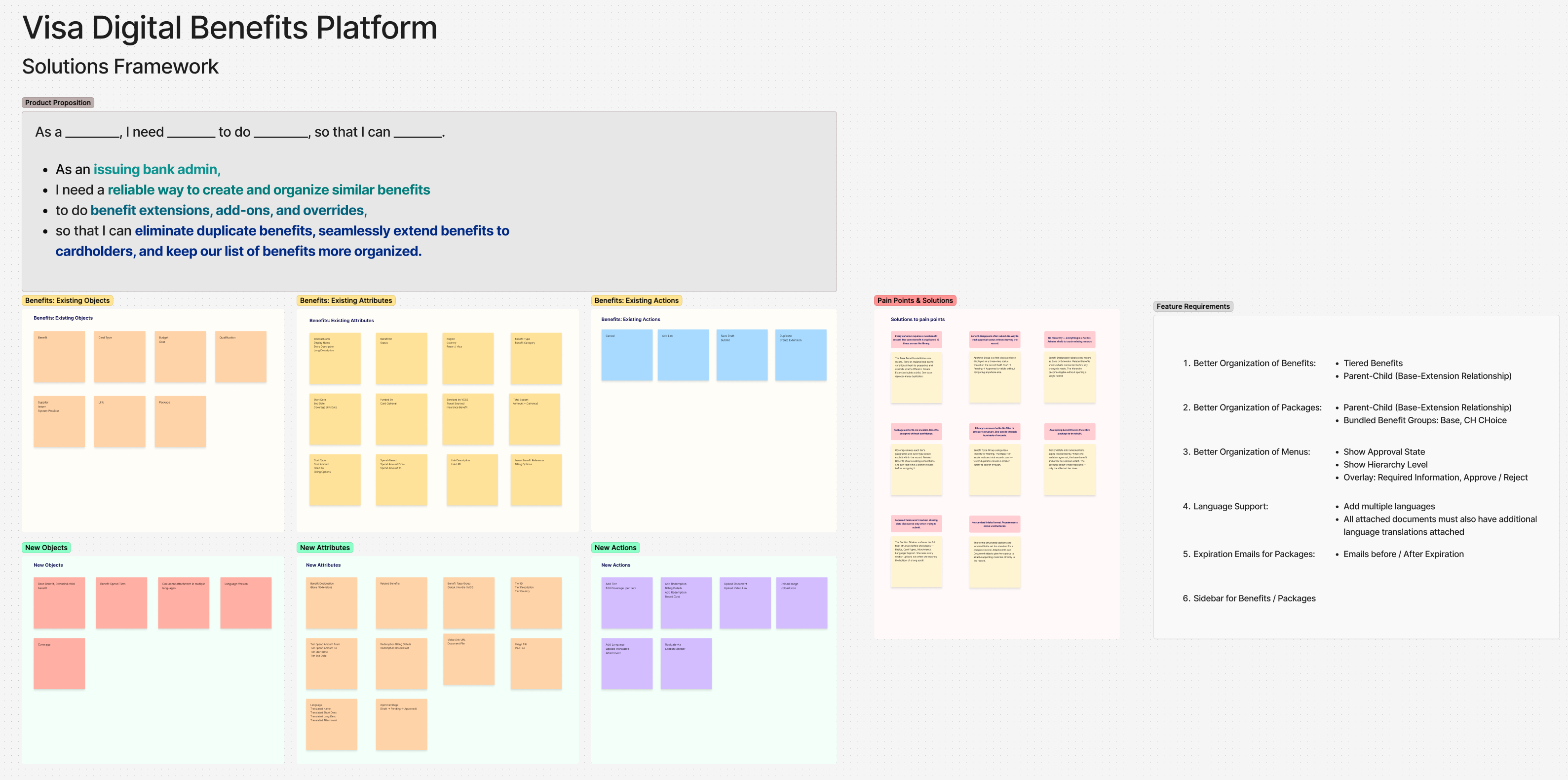
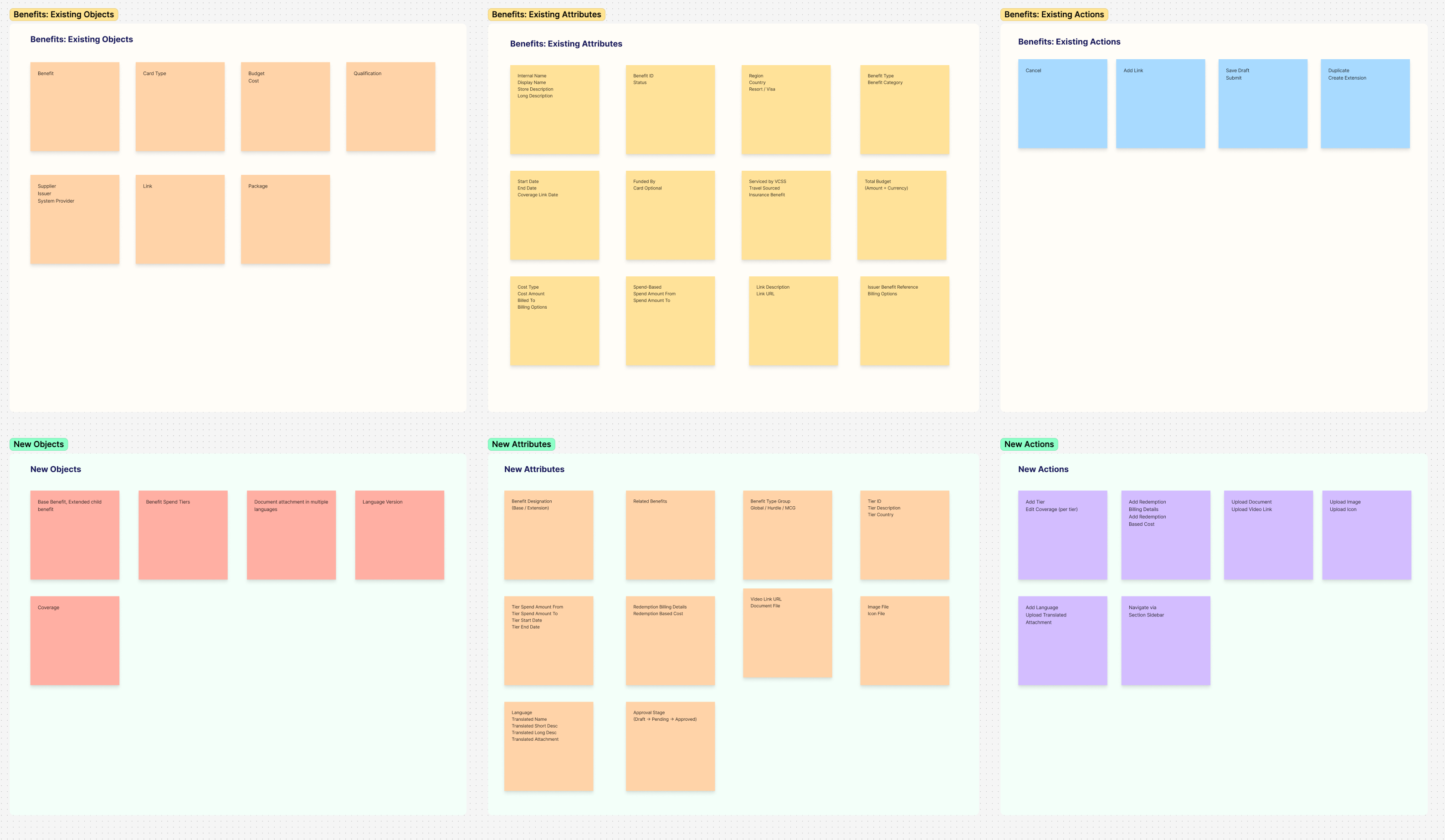
The Objects / Attributes / Actions framework
To design new features for an existing system without breaking it, I needed to understand the system's underlying grammar — not just how it looked, but how it was structured. I developed the Objects / Attributes / Actions (OAA) framework to map what already existed and what needed to be added.
Existing Objects included Benefit, Card Type, Budget, Qualification, Supplier, Package, and Link. Existing Attributes covered everything from internal name and status to region, benefit type, cost structure, and approval state. Existing Actions were limited: Cancel, Add Link, Save Draft, Submit, Duplicate, Create Extension.
The new objects, attributes, and actions I proposed were mapped against the existing ones — not to replace them, but to extend the system in ways that felt coherent with what was already there. New Objects included Base Benefit (with extension children), Benefit Spend Tiers, Coverage, and Language Version. New Actions included Add Tier, Add Redemption, Upload Document, Navigate via Section Sidebar, and Duplicate to Section Scheme. Every addition was designed to be invisible seams, not visible breaks, in the existing product.
From insight to solution — eight pain points, eight fixes
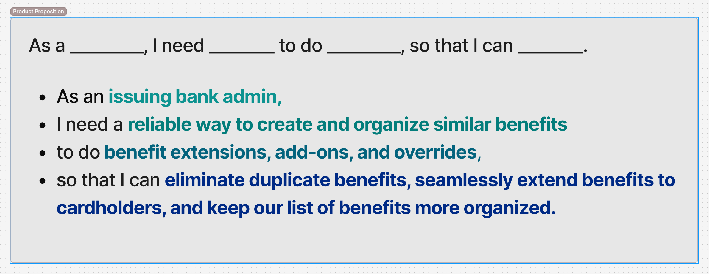
The product proposition was simple once the research was clear: as an issuing bank admin, I need a reliable way to create and organize similar benefits, to do benefit extensions, add-ons, and overrides, so that I can eliminate duplicate benefits, seamlessly extend benefits to cardholders, and keep our list of benefits more organized.
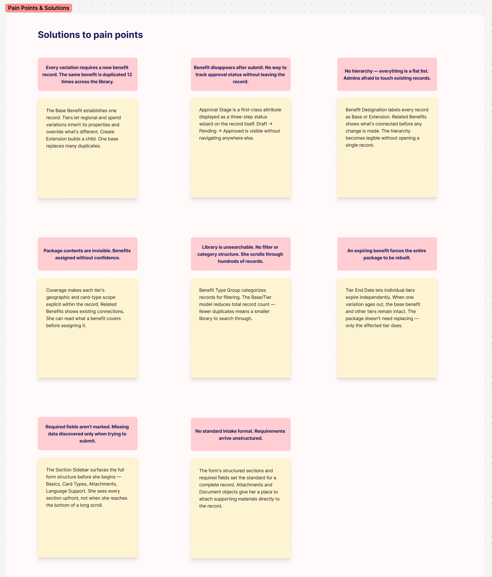
From that proposition, I mapped eight pain points directly to design solutions — a concrete decision for every documented failure:
Every variation requiring a new record → Base/Extension model with inheritance. Benefit disappears after submit with no status visibility → Approval Stage as a first-class three-step status wizard on the record itself. No hierarchy, flat list, admins afraid to touch records → Benefit Designation (Base vs Extension) labels on every record, Related Benefits showing connections before any change is made. Package contents invisible → Coverage making each tier's geographic and card-type scope explicit. Library unsearchable → Benefit Type Group for categorization, reducing total record count. Expiring benefit forces entire package rebuild → Tier End Date letting individual tiers expire independently. Required fields not marked → Section Sidebar surfacing the full form structure before the user begins. No standard intake format → Structured sections and required fields setting the standard for a complete record.
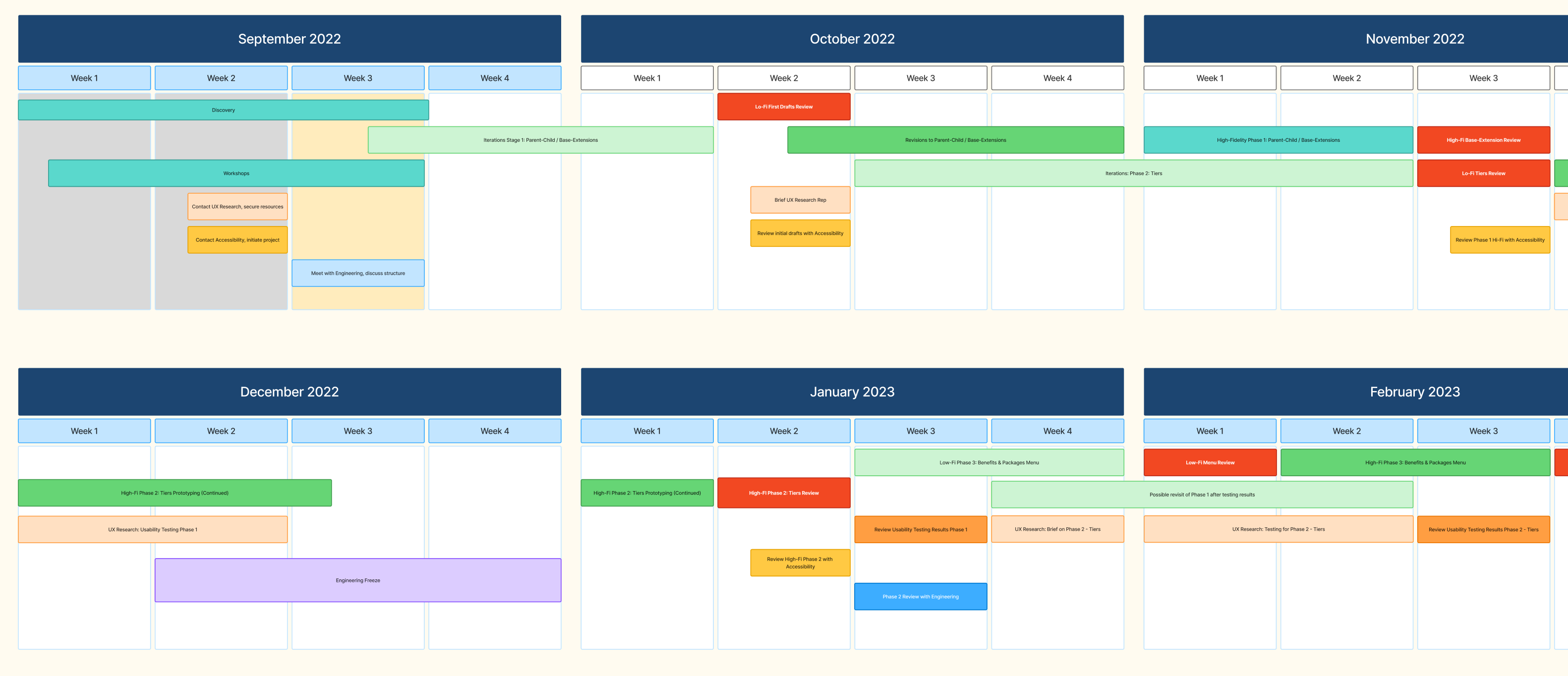
Six months from discovery to high-fidelity
The project ran from September 2022 through February 2023, across three phases. Phase 1 addressed the Parent-Child / Base-Extension model — the foundational structural change. Phase 2 tackled Tiers — the spend and coverage tier system that let individual variations expire independently. Phase 3 redesigned the Benefits & Packages Menu — the navigation surface that had to surface hierarchy without overwhelming users who already knew the flat version.
Each phase ran discovery, lo-fi, usability testing, accessibility review, high-fi, and engineering review in sequence. The phases overlapped deliberately — Phase 2 low-fi ran concurrently with Phase 1 usability testing, so findings from one informed the other. A six-week engineering freeze in December 2022 was used to complete Phase 2 high-fidelity work, so implementation could begin immediately when the freeze lifted.
Before designing anything, I had to understand what I was actually designing for. VDBP is a many-to-many system: a single benefit can belong to multiple packages; a single package can contain dozens of benefits; a card product can carry multiple packages; and each of those relationships carries its own rules, states, and constraints. Change one thing in the right place, and it cascades correctly. Change it in the wrong place, and it quietly breaks something three levels away.
This is the same Objects/Attributes/Actions framework from Discovery, applied at the scale of the whole system rather than one benefit. An approval action on a single object updates that object's own state, but the state has to read correctly everywhere the object is referenced — in a package, in a menu row, in another admin's queue three clicks away. The diagrams alongside show the shift concretely: the old flat structure, with no way to express a relationship between two records, next to the new object model that made inheritance and containment explicit.
From duplication to structure
The parent-child model was the project's founding premise—it existed before I was assigned to it. What I had to do was make it real in the interface, and solve every edge case that came with it.
The core idea: instead of creating a new benefit for every regional or tier-based variation, admins define a base benefit once. Child benefits inherit the parent's attributes automatically—coverage rules, eligibility logic, geographic constraints—and can selectively override only what needs to change. A grandchild benefit inherits from its parent, which inherited from its grandparent. The hierarchy is live, not copied.
This is where the Objects/Attributes/Actions framework became essential. Inheritance means that an attribute set on a parent object propagates silently down the tree. The interface had to make that propagation visible and trustworthy—users needed to know which attributes they owned and which they had inherited, and what the downstream consequences of changing either would be.
The risk was real: build the extension model wrong, and existing packages break. Cardholders lose benefits they're entitled to. Banks file complaints. We had to design the system so that extensions could only modify what was safe to modify—certain attributes were editable, others were locked at the parent level—and so that adding or removing a child benefit couldn't silently invalidate the package it belonged to.
That meant designing explicit guardrails, clear inheritance indicators, and conflict messaging that told admins exactly why something was blocked and what to do about it. Not every edge case was glamorous work. Most of it was grinding through scenarios until we were confident nothing could fall through.
The business problem
The old model had no inheritance, no hierarchy, no shortcuts. If a benefit needed to work slightly differently for Brazilian cardholders versus Mexican ones, an admin created two separate benefit records—full stop. Multiply that across dozens of banks, hundreds of card products, and thousands of regional variations, and you get a library that nobody can navigate and everyone is afraid to touch.
The costs were real: duplicated work, slower approvals, and a growing risk that nobody knew which benefit record was the authoritative one.
What "success" meant
We aligned on five outcomes:
- Eliminate duplication without sacrificing regional flexibility
- Make relationships between benefits explicit and navigable
- Surface approval states clearly so admins could act fast and with confidence
- Prevent invalid configurations before they could propagate downstream
- Keep the interface comprehensible as the system grew more complex
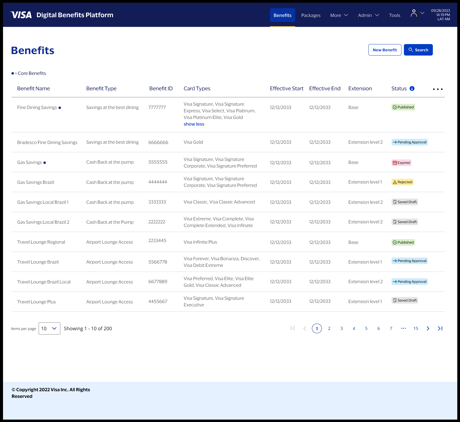
1) Decision-ready menus
The benefits and packages menus had to do real work. At Bradesco and other issuing banks, admins were processing approvals at volume—they needed to scan a list and know immediately what required attention, what was safe to publish, and what was stuck.
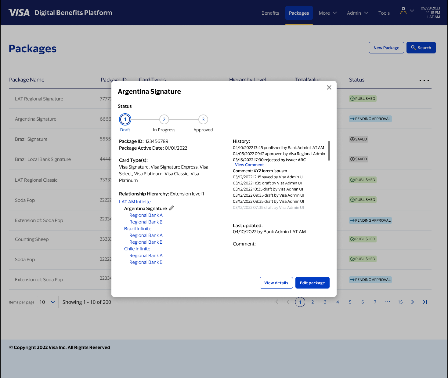
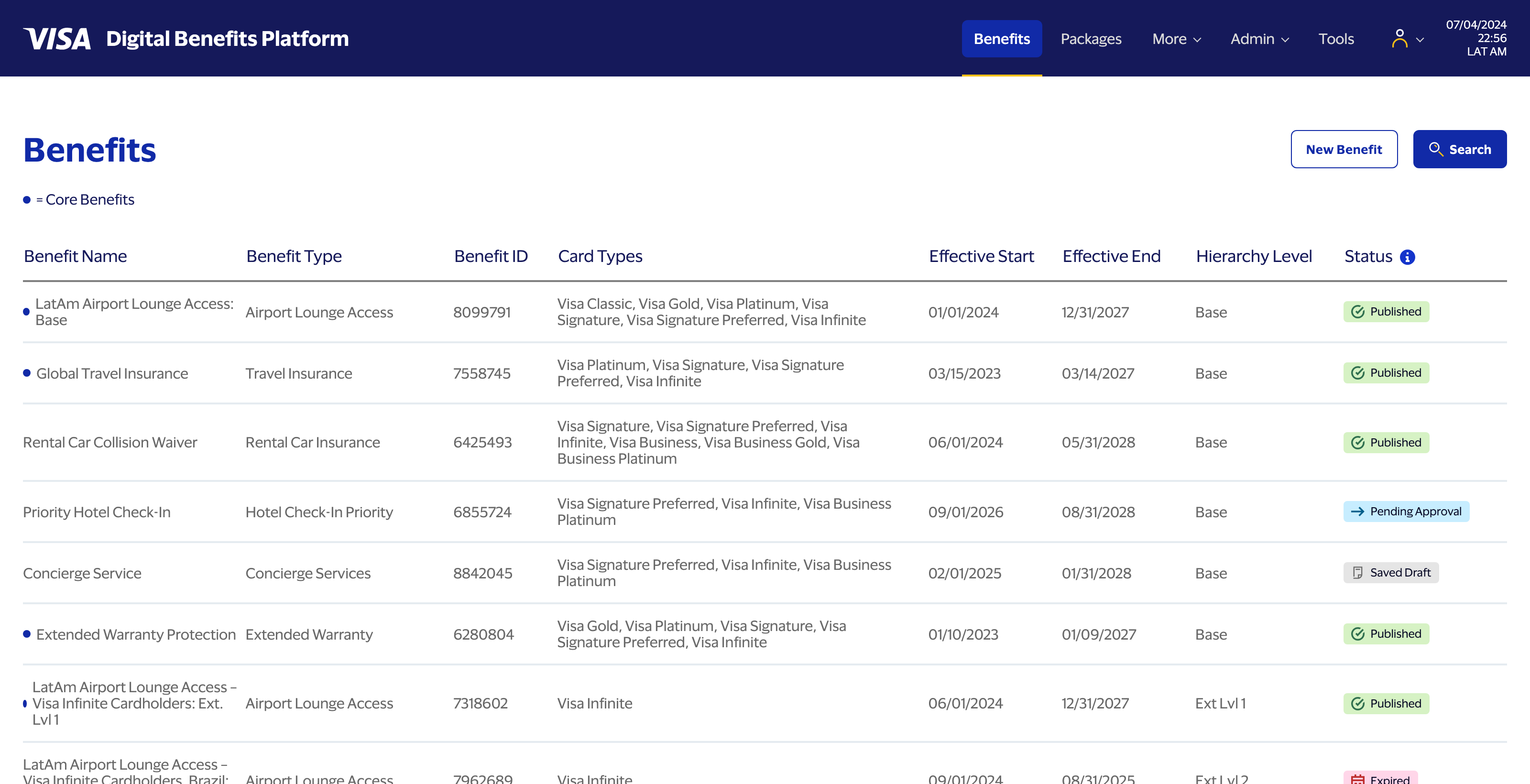
I added hierarchy and approval state as first-class information in the menu view. Base benefits and extensions are visually distinct. Status badges—Saved Draft, Pending Approval, Published, Expired, Rejected—are scannable at a glance. In Objects/Attributes/Actions terms: the menu surfaces the most decision-critical attributes of each object, so the action an admin needs to take is immediately obvious.
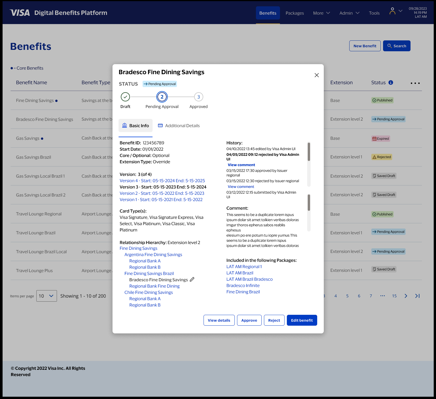
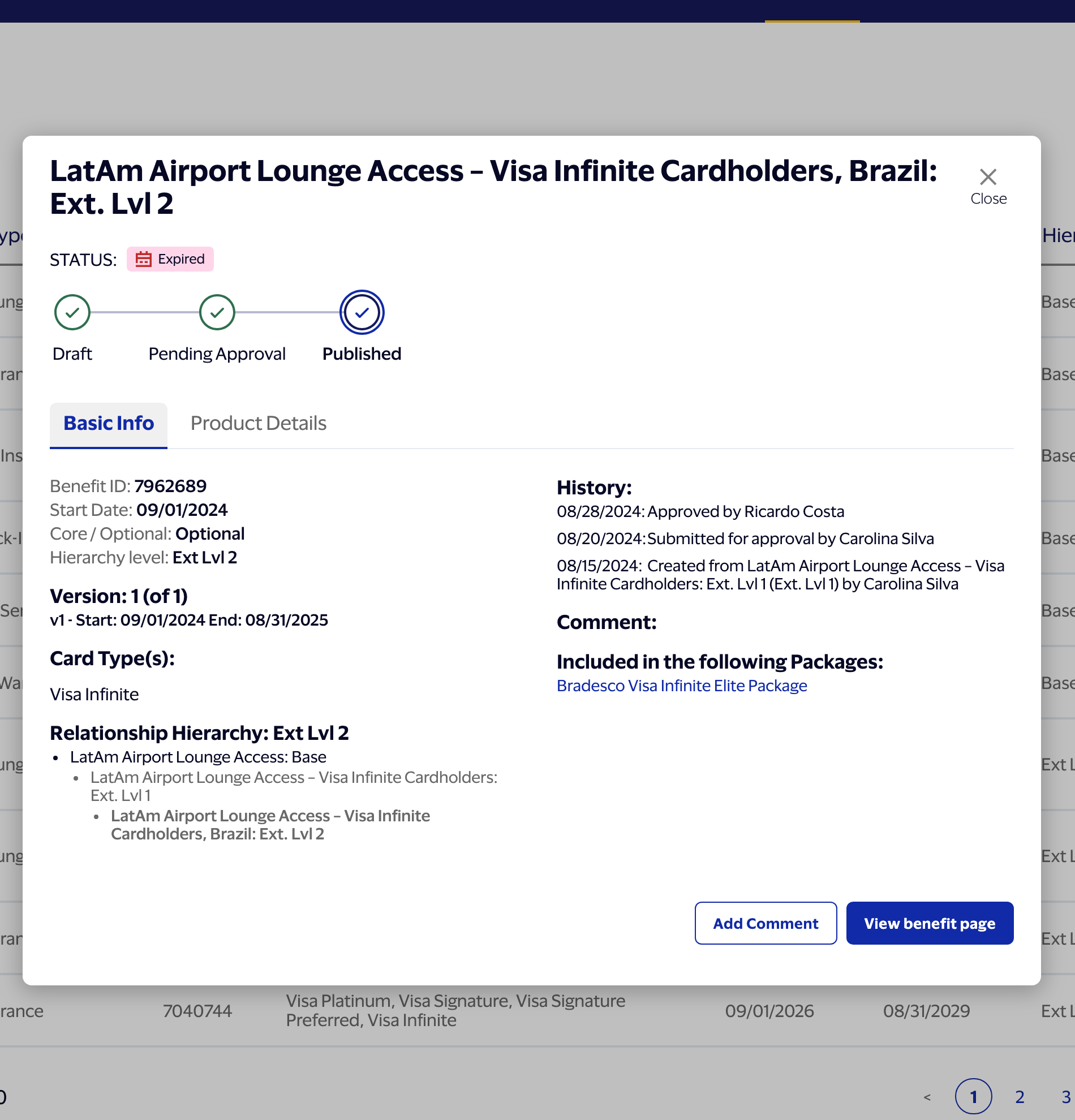
2) Quick-view overlays
This was one of my ideas, and it became one of the most-cited improvements in user feedback.
Previously, reviewing a benefit or package meant opening the full detail page, locating the relevant data, making a judgment, then navigating back. For teams processing dozens of approvals, that context-switching added up fast.
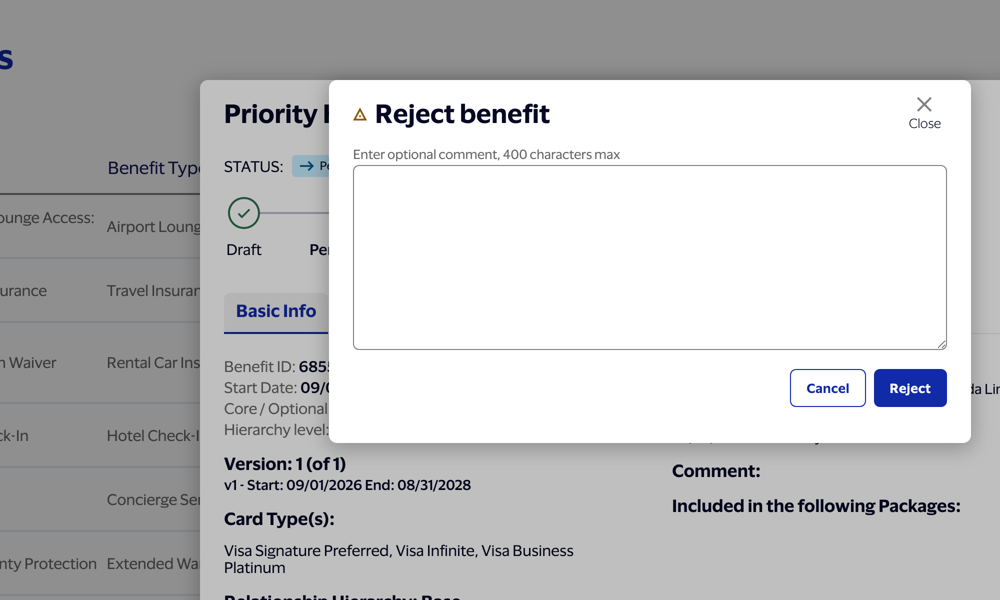
The overlay pattern lets an admin see everything needed to make an approval decision—status, history, relationship hierarchy, key attributes—without leaving the menu. The action is available exactly where the object is being evaluated. Approve, reject, or flag for edit, all in place. Users reported that this alone sped up the approval workflow by 15–20%. At the volume Bradesco operates, that's meaningful.
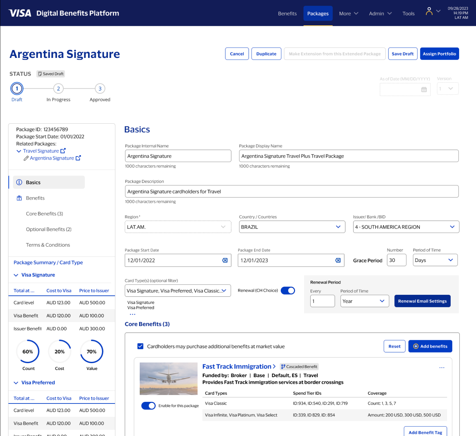
3) A persistent sidebar as the mental map
In a many-to-many system with parent-child relationships, package inheritance, and approval states all operating simultaneously, it's easy to lose your bearings inside a detail view. The sidebar was my solution to that.
On benefit detail pages, the sidebar shows where you are in the object hierarchy—base or extension, which parent it belongs to, which packages include it. On package pages, it surfaces tier-level summaries and breaks down cost and responsibility between Visa and the issuer. It answers the question every admin needs answered before touching anything: "What is this object, what does it belong to, and what inherits from it?"
Tiers, qualification, and rule complexity
Benefits are governed by layered rules: eligibility tiers, coverage limits, currencies, time periods, regional constraints. Each of these is an attribute of the benefit object—and each can be inherited, overridden, or locked depending on where the benefit sits in the hierarchy. The design had to support that depth without making simple tasks feel complicated—and without giving admins enough rope to hang themselves.
Language support and attachments
Benefits needed to support multiple markets and supporting documentation. Additional language support and attachments were designed as first-class sections so admins could manage localized content and required documents without losing context.
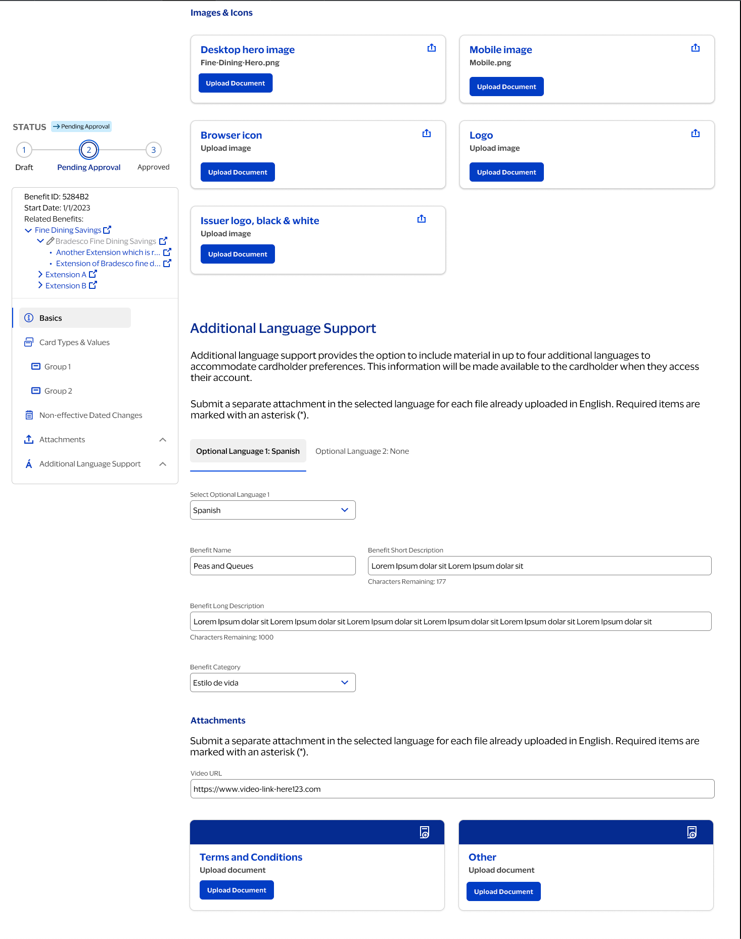
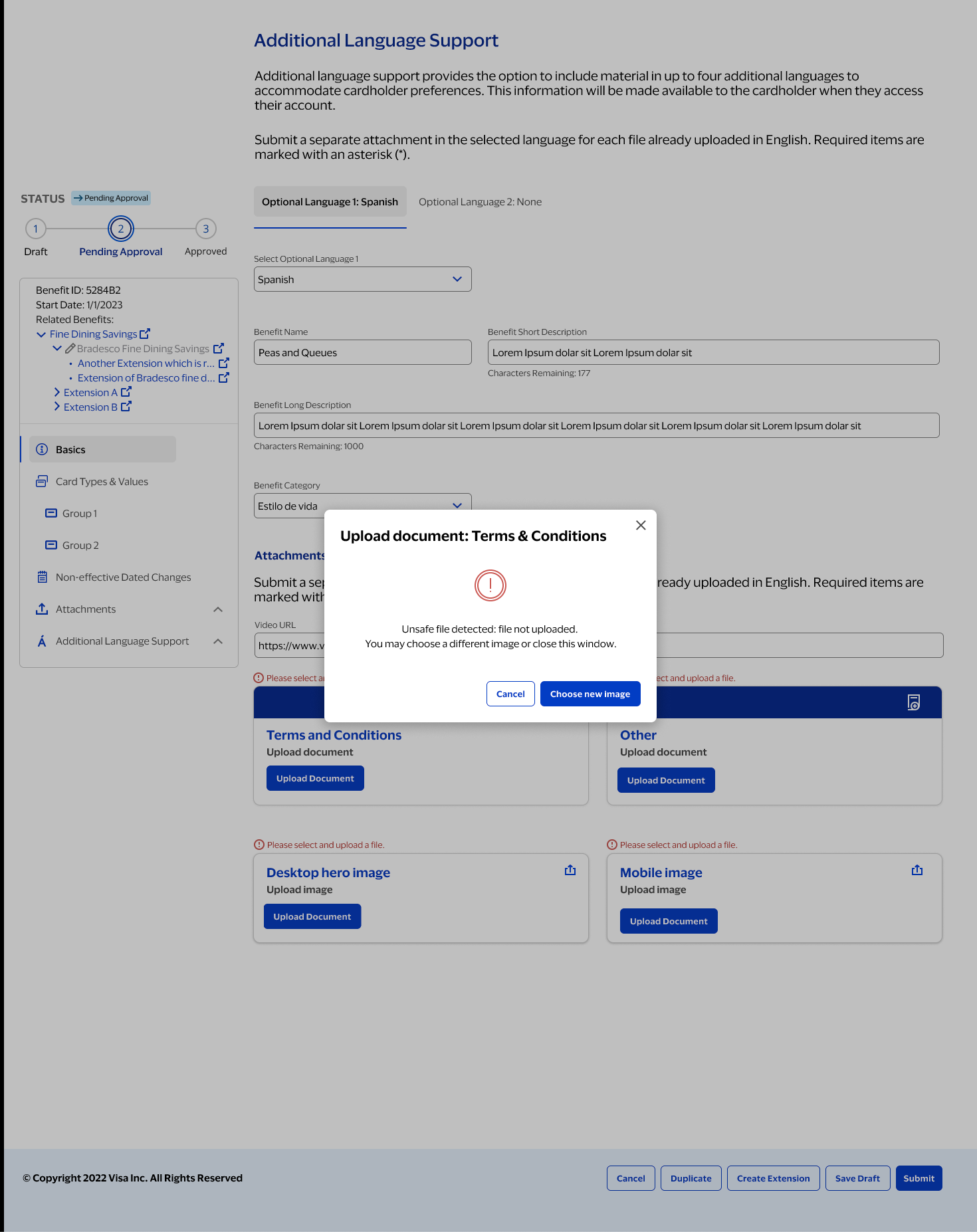
States and error handling
Unhappy paths mattered as much as happy ones. Partial completion, missing documents, validation failures—enterprise workflows hit all of these. The UI needed to surface what went wrong and what to do next, clearly and without drama, so admins could resolve issues without losing their place or their nerve.
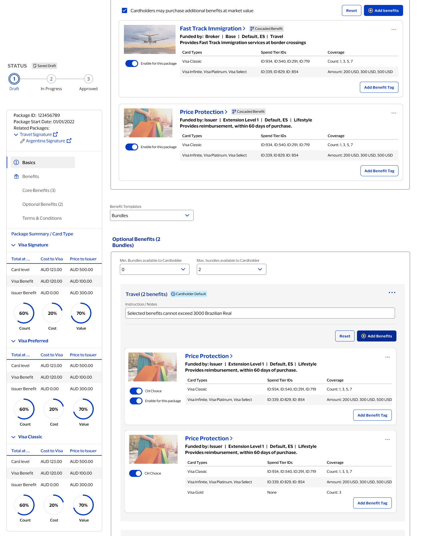
Benefit inheritance and cascading display
Packages are where benefits become "real" for cardholders—and where the many-to-many complexity becomes most acute. A package is itself an object, but it's also a container for benefit objects, each of which carries its own attribute set, inheritance chain, and approval state. The UI needed to show not only which benefits were included, but how they were inherited or cascaded from parent packages, and how optional bundles and cardholder choices affected the final structure.
Preventing conflicts when adding benefits
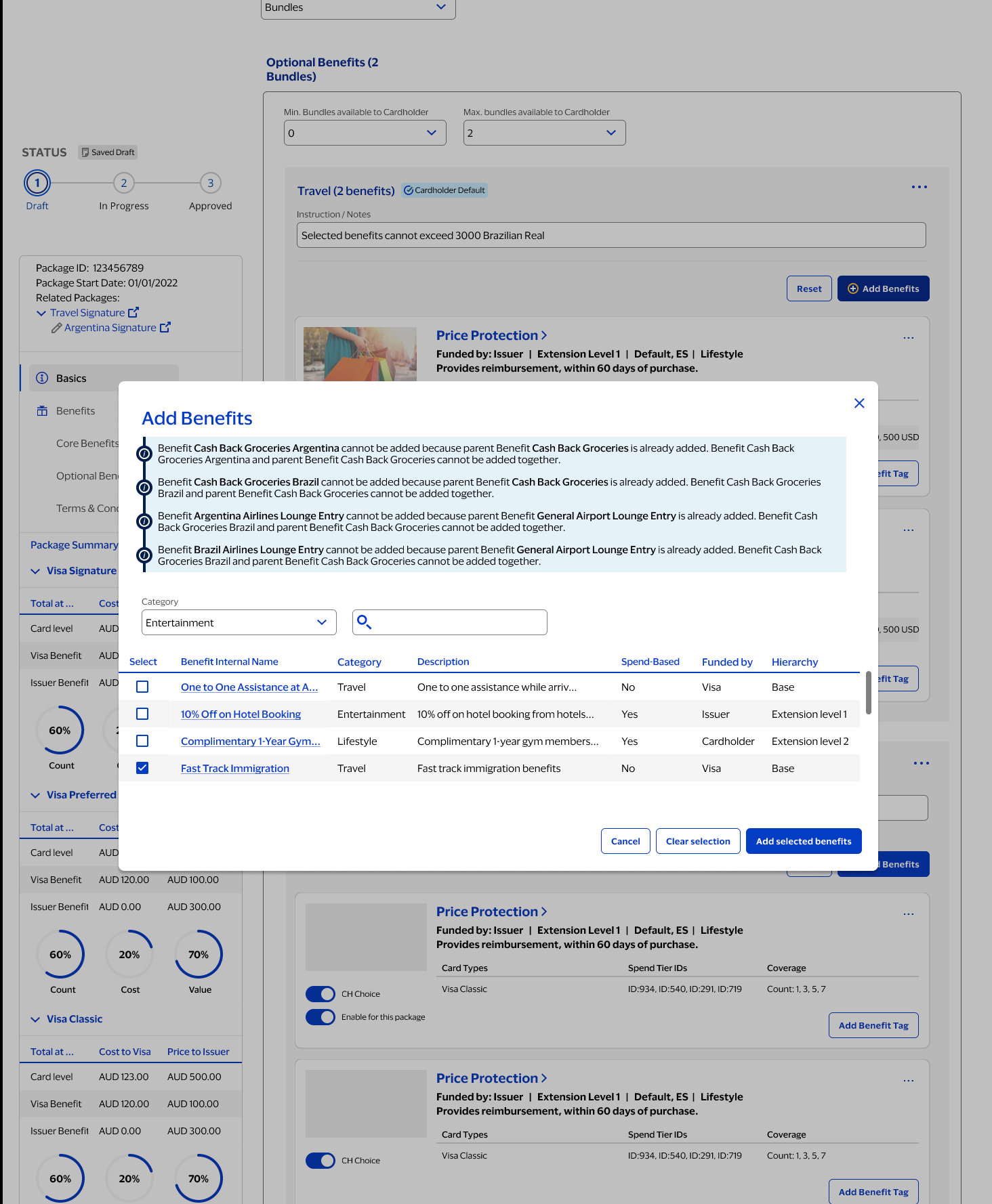
Adding benefits isn't just selecting from a list. The system enforces rules to prevent conflicts—a child benefit can't be added if its parent is already included, because the child's attributes would be redundant or contradictory. These constraints were made visible in-context so users understand why something is blocked and exactly how to proceed, rather than hitting a wall with no explanation.
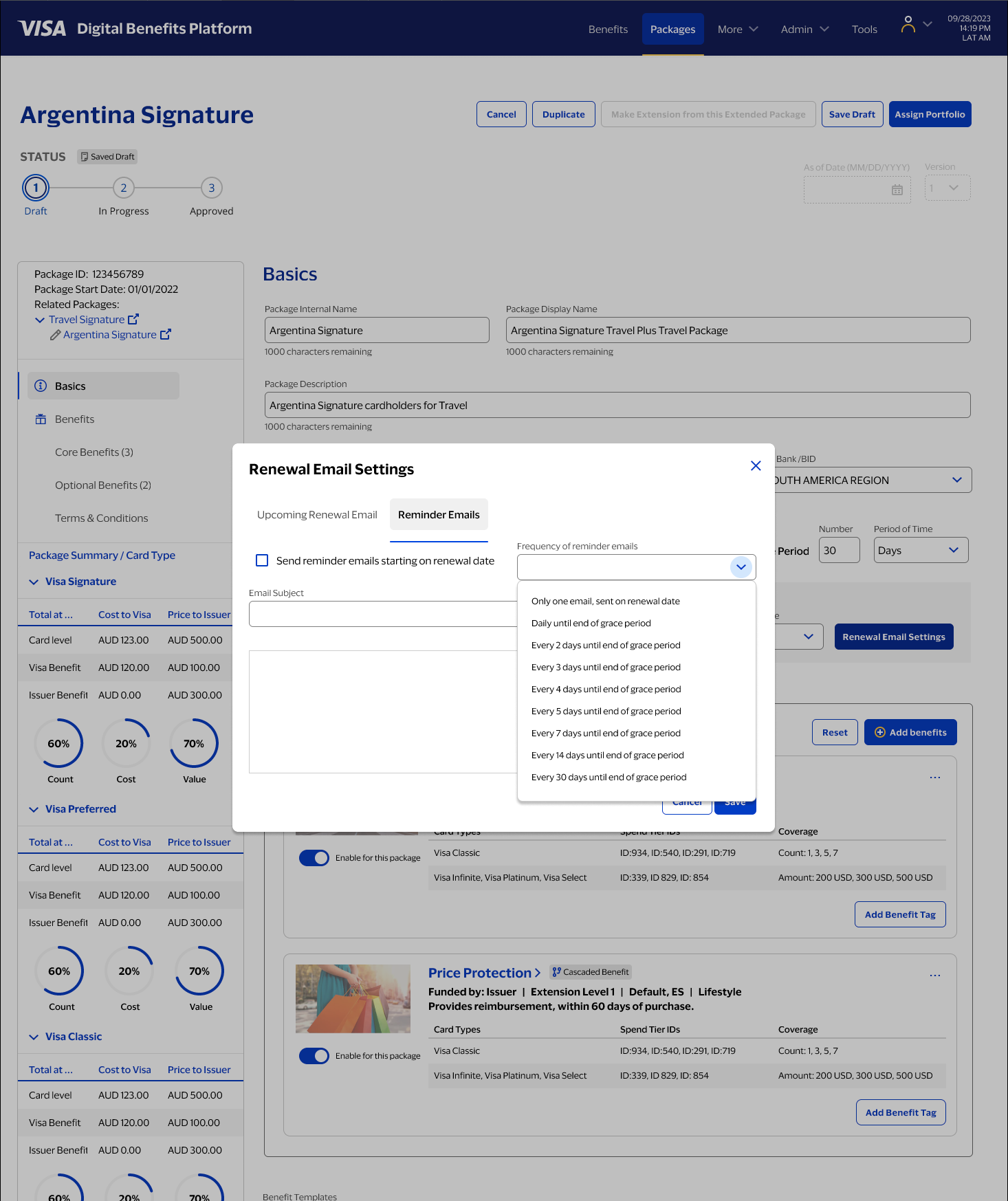
Operational tooling: renewal email settings
As VDBP matured, operational features were added to support real-world maintenance. Renewal reminders and email settings are one example: the product needed to handle time-based states and notifications without forcing admins out of their workflow.
A personal follow-up, not a continuation of the engagement
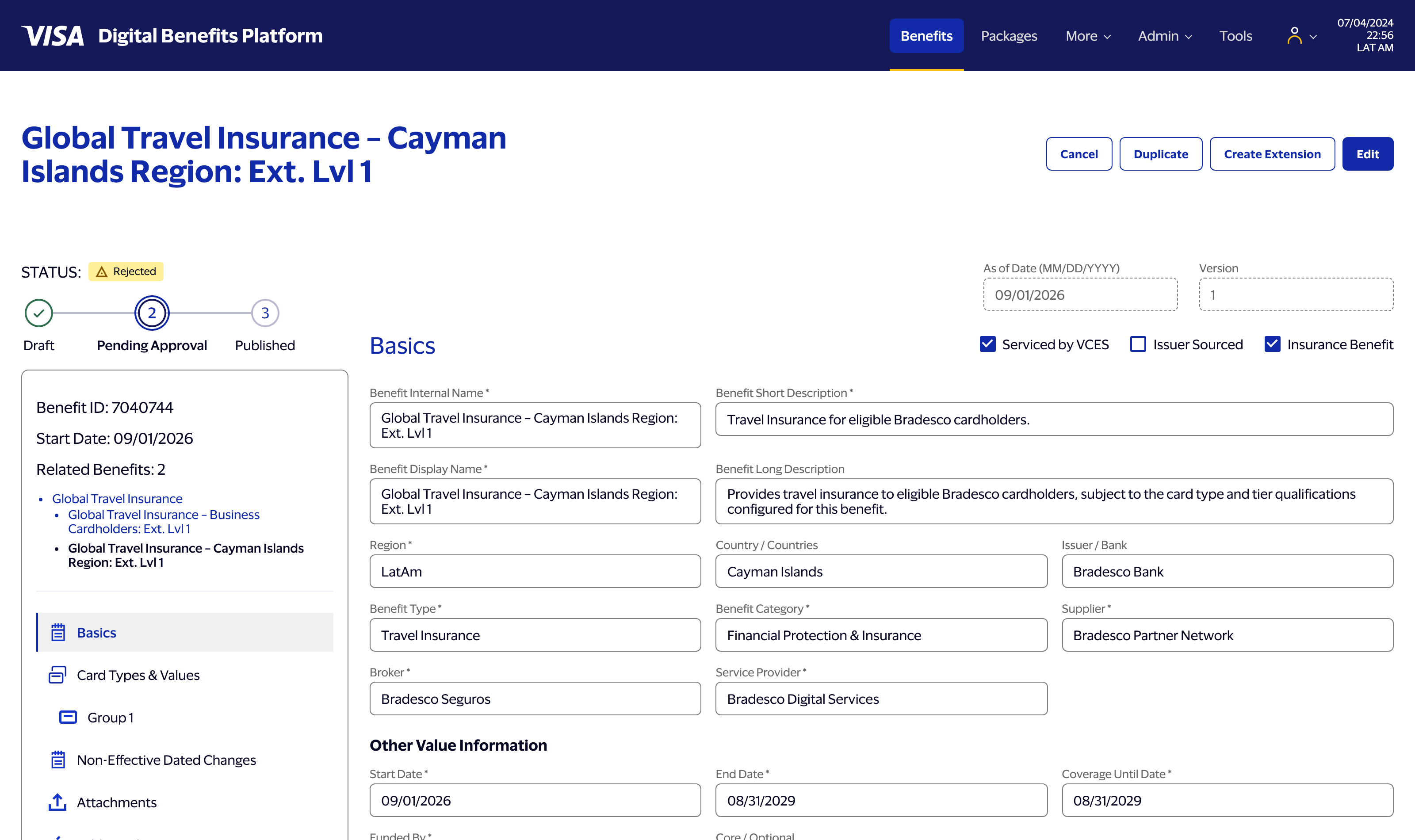
Everything above is real client work at Visa, delivered to production. What follows is different: after the engagement wrapped, I used Claude Code — Anthropic's AI coding agent — to build a working front-end prototype of an evolved version of this hierarchy model on my own time, independent of Visa or Bradesco. The goal wasn't to reproduce their actual implementation. It was to find out whether the interaction model I'd designed — Base benefits, live inheritance down through two levels of extension, an approval workflow with real state — actually held up once it was something a person could click through, not just something a person could look at.
I directed the build across a series of sessions from a detailed functional spec, the way I'd brief an engineering team: menu and detail overlay first, then a real benefit page, then Create Extension actually cloning a parent's data down through Extension Level 1 and Level 2, then unique data across the whole menu, then a working Approve / Reject / Comment decision loop with state that persists. My job through all of it was the same job it always is — reviewing output against the spec, catching what was wrong, and deciding what "correct" actually meant in cases the spec hadn't fully anticipated.
That review work turned up real bugs, not just typos. One example: the relationship hierarchy shown on a benefit is supposed to always trace back to its ultimate Base, however many generations deep it goes. Two generations in, it did. Three generations in, the display quietly started pointing at the wrong ancestor — the code was tracking the immediate parent correctly, but not the root. It's exactly the kind of edge case that's invisible until you actually build the third level and look, which is the whole reason this exercise was worth doing.
Making the approval workflow actually decide something
The quick-view overlay pattern from the original design got a real test here too: Approve, Reject, and Add Comment are live actions, not buttons that do nothing. Rejecting a benefit writes a real entry to its history, optionally with a comment, and moves its status — visibly, immediately, in the same overlay — without forcing a page reload to see the result. The decision persists if you close the overlay and come back to it later, which sounds like a small thing until you consider that it wasn't: an early version of the timestamp logic was quietly borrowing a value meant for a different purpose, and a fresh decision was sorting into the middle of a benefit's history instead of on top. Caught by testing the actual interaction, not by reading the code.
None of this replaces the original research or the original design decisions — it's downstream of them. But it's a different kind of validation than a usability test or a stakeholder review: does the model still make sense once every inheritance rule, every guardrail, and every state transition has to actually execute, not just be described.
A build log kept in real time
While directing the build, I had Claude Code keep a running log of the process itself — session by session, in its own words: what got built, what broke, what got corrected, and why. It reads less like a highlight reel and more like an engineering changelog, which is the point. The result is its own kind of case study — of the process of directing an AI coding agent, not of the product.
What I'm proud of
The system got significantly more complex during the project—more tiers, more states, more edge cases—and the interface absorbed that complexity without becoming brittle. The Objects/Attributes/Actions framework held up. The guardrails held. The overlays worked. The sidebar kept people oriented when the underlying model was genuinely hard to reason about.
Most of all: we didn't break anything. In a system where a bad configuration can affect real cardholders at a major bank, that's not a small thing.
What I'd improve next
Before an admin publishes a change that cascades through packages and assignments, they should be able to see exactly what will be affected. A clear "what will change?" preview—before committing, not after—would make an already-safe system feel trustworthy in a way that's immediately legible. That's the next layer I'd go after — and, fittingly, it's the kind of feature I'd want to prototype the same way I built the extension hierarchy above: not just designed, but actually built, so I can be sure it behaves the way it looks like it should.
VISA DASHBOARD
The Visa Government Insights Dashboard, a real-time economic view for government and non-government policy makers.
VISA DASHBOARD CASE STUDY
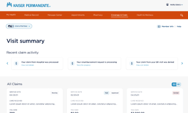
KAISER MEDICAL
Streamlining the Kaiser Permanente medical claims experience to make billing more comprehensible.
KAISER CASE STUDY
AUGUR AI
A tool for Heuristics and Accessibility evaluation, powered by AI via the Claude API, for any URL.
AUGUR CASE STUDY