Visa Government Insights Hub
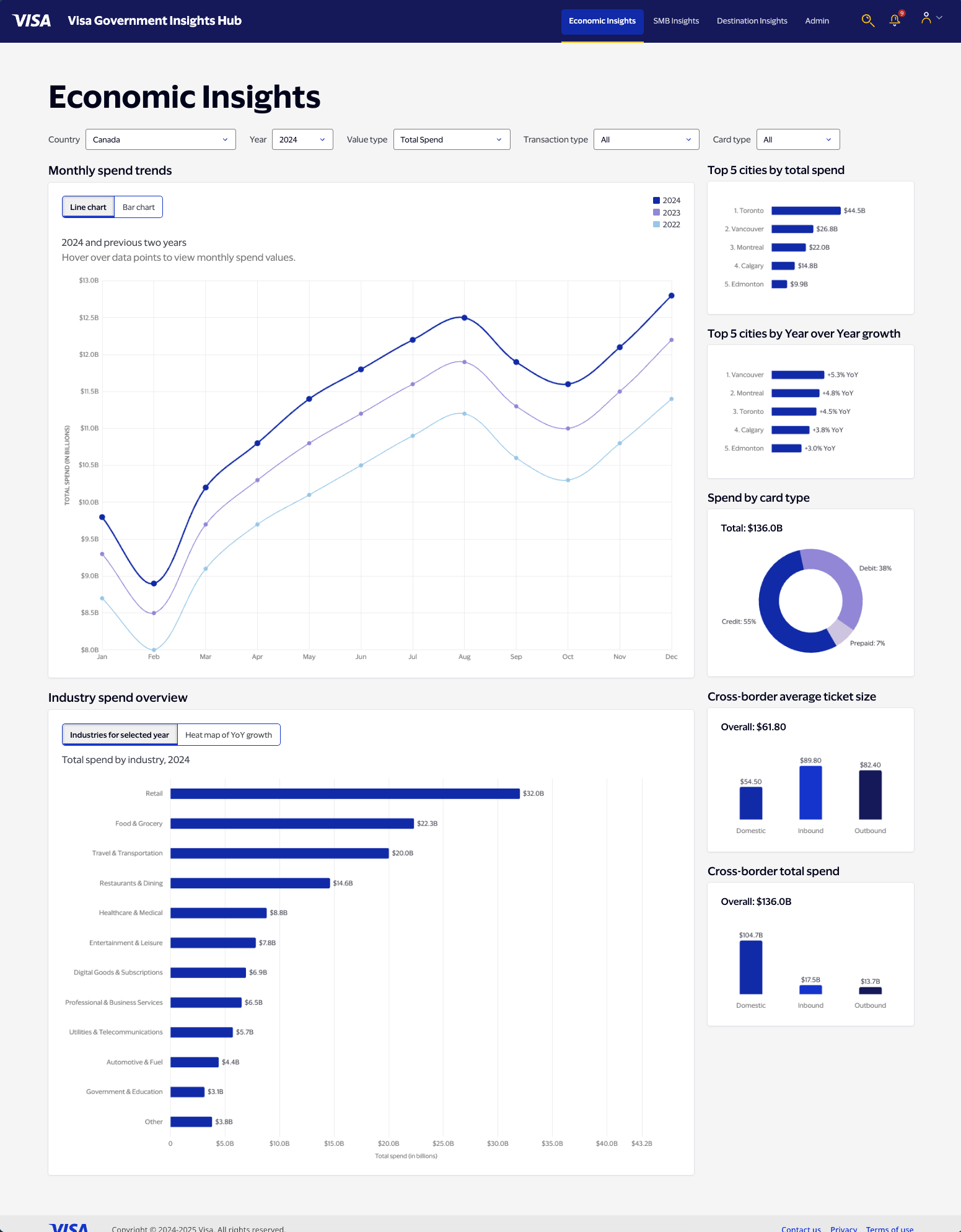
Visa's own transaction data sat locked behind economists and quarterly reports. I designed a self-service dashboard that turned it into real-time economic intelligence for governments and enterprises — a new subscription product, not just a visualization. In 2026 I rebuilt the same dashboard as a live, responsive prototype using Claude Code and Chart.js.
Highlights
- Designed a five-filter, seven-chart system where every filter updates all charts at once, and chart-mode toggles (line/bar, heat map) persist independently of the filter state — a deliberate interaction decision, not a default.
- Built the dashboard as a live, responsive prototype in Claude Code and Chart.js from a CLAUDE.md brief. Diagnosed a Session 2 token-limit failure and fixed it by restructuring data generation into sequential writes.
- Turned data that was previously locked behind specialist economists into a new subscription-based revenue stream for Visa, priced by geographic coverage.
- Grounded every chart in economically realistic data: Canada's billions vs. Belize's millions, Chile's 2022 commodity-driven spike, so the numbers hold up under a real analyst's scrutiny.
01Project Brief
Visa's transaction data reflected real economic activity in real time, but only specialist economists could read it, and by the time a report reached anyone else, it was months stale. I designed VGIH to solve accessibility, speed, and actionability at once, turning raw data into a new subscription product for governments and enterprise clients.
Project Brief
Visa's transaction data reflected real economic activity in real time, but only specialist economists could read it, and by the time a report reached anyone else, it was months stale. I designed VGIH to solve accessibility, speed, and actionability at once, turning raw data into a new subscription product for governments and enterprise clients.
Overview
Visa processes billions of transactions globally, generating a dataset that reflects real-time economic activity across countries, industries, and consumer segments. But that data was locked behind complexity: accessible only to specialist economists, requiring custom analysis, delivered months after the fact.
The Visa Government Insights Hub transformed this into a self-service analytics platform. Government agencies, central banks, investment firms, and enterprise clients could extract actionable economic intelligence without needing an economics degree or a data team. This wasn't just a dashboard — it became a new subscription-based revenue stream for Visa, turning proprietary transaction data into a strategic intelligence product, priced by geographic coverage and sold to some of the most analytically demanding audiences in the world.
The challenge
The problem had three dimensions:
- Accessibility. Only trained economists could interpret Visa's raw transaction data; government clients had to hire specialists just to understand what the numbers meant.
- Speed. Traditional economic indicators publish quarterly, months after the fact. By the time a finance ministry saw Q2 data, they were already in Q4.
- Actionability. Raw transaction volume doesn't tell you whether to adjust interest rates, where to invest in infrastructure, or which markets to enter next.
The core design question: how do you turn massive, complex datasets into clear, immediate, actionable intelligence, without overwhelming users or requiring deep technical expertise?
02Research & Discovery
VGIH had to serve two audiences at once: economists who wanted speed and flexibility on top of data they were already comfortable with, and non-economist decision-makers who needed a clear narrative, not raw numbers. Even the most analytical users needed clear framing, and the subscription pricing model meant the interface had to stay intuitive enough for self-service while sophisticated enough to justify a premium.
Research & Discovery
VGIH had to serve two audiences at once: economists who wanted speed and flexibility on top of data they were already comfortable with, and non-economist decision-makers who needed a clear narrative, not raw numbers. Even the most analytical users needed clear framing, and the subscription pricing model meant the interface had to stay intuitive enough for self-service while sophisticated enough to justify a premium.
My role
I was the sole designer on VGIH, embedded across product, engineering, and research, working alongside a data visualization specialist who later developed Visa's internal Data Visualization Guide, partly shaped by our collaboration. My work spanned UX and visual design for the Economic Insights dashboard, the filtering system, data hierarchy, comparative analysis tools, and design patterns that extended to future data modules.
Two audiences, two different needs
Economists and policy analysts, central bank officials, finance ministry teams, economic development agencies, needed multi-year trend analysis, sector breakdowns, and regional comparisons. They were comfortable with data complexity; what they needed was speed and flexibility.
Non-economist decision-makers, investment strategists, retail executives, tourism boards, needed clear narratives, not raw numbers. They weren't asking what the transaction volumes were. They were asking whether consumer spending was accelerating or slowing, which sectors were growing, whether they should be worried. Testing surfaced a critical insight: even highly analytical users need clear framing and context, not just accurate data. The interface had to speak to both audiences at once, precise enough for experts, legible enough for executives.
The business opportunity
Government agencies and commercial enterprises pay subscription fees to access VGIH, with pricing tiers based on geographic coverage. A Canadian finance ministry might start with domestic data, then upgrade to view neighboring economies for cross-border comparison. That created a core design constraint: the interface had to be intuitive enough for self-service use while sophisticated enough to justify premium pricing. Complexity had to be managed, not hidden.
03Design System & Figma Architecture
The full dashboard was designed in Figma before a line of code existed, with a component system, design tokens, and every filter and toggle combination prototyped. That wasn't decoration — it was the brief the eventual code sessions built against.
Design System & Figma Architecture
The full dashboard was designed in Figma before a line of code existed, with a component system, design tokens, and every filter and toggle combination prototyped. That wasn't decoration — it was the brief the eventual code sessions built against.
Building the Figma foundation
Before writing a single line of code, the dashboard was fully designed in Figma, with a complete component system, design tokens, and a prototype that showed every filter state and chart toggle combination. This wasn't decoration. It was the brief.
The Figma file includes individual chart components, filter dropdown states, the navigation system, and annotated layout specs. Every component was built with eventual code output in mind: consistent naming, token-driven colors, and auto layout that mapped cleanly to CSS flexbox behavior.
The tangled web of prototype connections visible in the Figma canvas reflects the real complexity of the interaction model: five independent filters, two chart toggles, and seven charts that all update simultaneously. Designing that logic in Figma first meant the code sessions had a clear contract to build against.
04Key Decisions & Tradeoffs
Four decisions shaped the dashboard: a five-filter system where every combination updates all seven charts while chart-mode state persists independently; dual visualization modes (line vs. bar, and a heat map for growth-by-sector) instead of forcing one chart to answer every question; five contextual panels that reframe the same data instead of just repeating it; and economically realistic data so the prototype holds up under real analyst scrutiny.
Key Decisions & Tradeoffs
Four decisions shaped the dashboard: a five-filter system where every combination updates all seven charts while chart-mode state persists independently; dual visualization modes (line vs. bar, and a heat map for growth-by-sector) instead of forcing one chart to answer every question; five contextual panels that reframe the same data instead of just repeating it; and economically realistic data so the prototype holds up under real analyst scrutiny.
1) A five-filter system that compounds intelligently
Users needed to ask questions from multiple angles at once. The filter bar supports dynamic refinement by Country, Year, Value Type (spend vs. transactions), Transaction Type (all/in-person/digital), and Card Type (all/credit/debit/prepaid). Every combination updates all seven charts simultaneously, and the filter state persists independently of chart toggle state — changing the country doesn't reset whether someone was viewing a bar chart or a line chart. The Y-axis scales automatically per country, reflecting real economic differences in magnitude: Canada's spend is measured in billions, Belize's in millions, and the dashboard makes that clear without requiring the user to know it in advance.
2) Dual-mode visualization, same data, different questions
The Monthly Spend Trends chart displays rolling three-year data. Line charts reveal trajectory and seasonal patterns; bar charts compare discrete timeframes better, December 2023 against December 2024. Rather than choose one, I gave users both, with the toggle state independent of the filter state so switching countries never resets it. Toggle persistence was a specific decision I made, not a default: it respects the user's intent.
The Industry Spend Overview uses the same toggle pattern but a different strategy. Instead of a second line chart, which would cram thirteen industries onto one canvas, I designed a heat map showing year-over-year growth by sector. A finance ministry analyst sees "Entertainment +4.5%, Retail −2.1%" and immediately knows consumer behavior is shifting from goods to experiences.
3) Five contextual panels that change the frame
The right column isn't a sidebar. It's five distinct analytical lenses on the same data, each answering a question the main charts can't: top cities by total spend (rising tide or one city carrying the economy), top cities by year-over-year growth (often different cities than the spend leaders), spend by card type (a proxy for financial inclusion), cross-border total spend (money flowing in, out, or staying home), and cross-border average ticket size (rising volume isn't the same as rising prosperity). Each panel updates with every filter change — they're part of the analysis, not decorative context.
4) Data that tells the right story
A portfolio prototype with uniform, invented numbers would undercut the entire argument. The data here is economically realistic, benchmarked against actual transaction volume scales per country, with year-over-year growth patterns that reflect real post-COVID economic behavior. Canada's 2021 recovery curve looks different from Barbados's because they are different economies: Barbados is tourism-dependent, and its rebound tracks actual travel resumption; Chile's 2022 spike reflects commodity export conditions. I made that a design decision about what the prototype is actually demonstrating, not an afterthought — an analyst looking at this dashboard should see something that feels true.
05AI-Assisted Build Workflow
I rebuilt the dashboard in Claude Code across four structured sessions from a CLAUDE.md brief specifying strict file separation, exact colors, and interaction rules. Session 2's data-generation task blew through a token limit on the first attempt; I diagnosed the failure and had it write the file in sequential chunks instead, rather than one massive pass.
AI-Assisted Build Workflow
I rebuilt the dashboard in Claude Code across four structured sessions from a CLAUDE.md brief specifying strict file separation, exact colors, and interaction rules. Session 2's data-generation task blew through a token limit on the first attempt; I diagnosed the failure and had it write the file in sequential chunks instead, rather than one massive pass.
How this was built
This dashboard was built in Claude Code using a four-session structured plan. Before a single line of code was written, I authored a detailed CLAUDE.md briefing file, the project constitution Claude Code reads at the start of every session, specifying strict separation of concerns:
- index.html — markup
- styles.css — all visual styling
- data.js — all data arrays
- charts.js — Chart.js rendering
- filters.js — filter state management and event listeners
It also specified the font, the full color palette with exact hex values, the chart library (Chart.js only, no D3, no Recharts), economic scale benchmarks per country, year-over-year growth patterns with regional context, and the toggle-persistence interaction rule. The build ran across four sessions: Session 1 built the complete UI layout with hardcoded Canada data; Session 2 generated the full dataset, 60 base data objects across five countries and six years; Session 3 wired all filter logic; Session 4 added chart toggles and responsive layout.
The build wasn't without friction. Session 2's data-generation task exceeded token limits on the first attempt, a sub-agent stalled trying to write a massive file in a single pass. I diagnosed the failure, narrowed the scope to three countries, and directed Claude Code to write the file in sequential chunks instead of a single shot, managing the token budget for the rest of the session. The fix required understanding both what it was trying to do and why it failed, not just issuing a command.
The most valuable moments weren't when Claude Code got things right automatically. They were when I identified what was wrong and corrected it precisely: the Y-axis scaling inconsistencies, the toggle state resetting on filter changes, the heat map color gradient logic. Those corrections required knowing the design intent and understanding the implementation well enough to direct the fix.
06Mobile Experience
A five-filter bar across the top of a desktop dashboard doesn't translate to mobile, so I built it as a separate interaction model, not a breakpoint. All five filters collapse into a modal, active selections show as dismissible chips, and charts reflow to a single column.
Mobile Experience
A five-filter bar across the top of a desktop dashboard doesn't translate to mobile, so I built it as a separate interaction model, not a breakpoint. All five filters collapse into a modal, active selections show as dismissible chips, and charts reflow to a single column.
A different interaction model, not a scaled-down one
On small screens, all five filters collapse into a single modal triggered by a "Show all filters" button. Active filter selections show as dismissible chips beneath the button, so users always know what's active without opening the full filter panel.
Charts reflow to single-column. Toggles remain accessible. The heat map scrolls horizontally on narrow viewports. I built the mobile version as a separate page, not just a breakpoint, because the interaction model genuinely required rethinking, not just reflowing.
07Reflection
This project reinforced that users think in questions, not database schemas, and that clarity is itself a feature — the right column has five panels, not fifteen, on purpose. Rebuilding it with Claude Code confirmed something else: writing the project's CLAUDE.md brief, specifying what the code can and cannot do before it does anything, was itself a design act, not a handoff.
Reflection
This project reinforced that users think in questions, not database schemas, and that clarity is itself a feature — the right column has five panels, not fifteen, on purpose. Rebuilding it with Claude Code confirmed something else: writing the project's CLAUDE.md brief, specifying what the code can and cannot do before it does anything, was itself a design act, not a handoff.
What this project reinforced
Design for mental models, not data models. Users think in questions, not database schemas. The interface had to mirror how people actually reason about economic trends, not how the underlying data is structured.
Flexibility requires structure. Multiple views aren't about adding options, they're about matching visualization to task. Line charts for trends, bar charts for comparisons, heat maps for multi-dimensional growth at a glance. The same chart trying to answer every question answers none of them well.
Clarity is a feature. In data-dense products, the most valuable design move is often deciding what not to show. The right column has five panels, not fifteen, because fifteen would need a legend just to navigate.
Context transforms data into insight. The same number means different things depending on industry, geography, and time period. The interface makes that context effortless to grasp, not something users have to already know.
AI-assisted building is directing, not delegating. The CLAUDE.md sessions proved the output's quality is a direct function of the brief's quality. Writing that project constitution, specifying what the code can and cannot do before it does anything, was itself a design act.
What This Demonstrates
I designed VGIH to answer a specific translation problem: how do you turn a massive, precise dataset into something both an economist and a tourism-board director can act on, in the same interface? Every filter, toggle, and panel decision traces back to that question.
The economically realistic data wasn't a nice-to-have. A prototype with invented numbers would have undercut the entire argument that this design actually works for real analysis, so I made data integrity a design decision, not an engineering afterthought.
Rebuilding it in Claude Code in 2026 surfaced a specific, transferable lesson: diagnosing why an AI agent's approach failed, and redirecting it, is a different skill than writing a better prompt. Both matter, but they're not the same thing.