AUGUR
AUGUR runs a heuristic and accessibility evaluation on any URL, side by side, in the time it takes to load a page. I designed and built it end to end — the prompt architecture, the trust signals in the interface, and the production safeguards that keep a public AI tool from running up an unbounded bill. It pairs a real accessibility scanner for what can be measured with Claude for what has to be judged, and treats the difference between those two as the actual design problem.
Highlights
- Cut a third framework, Everett McKay's Intuitive Design, after testing whether Claude's training actually held it with any fidelity. The model declined to reproduce it, correctly naming the risk as confabulation, not recall.
- Split every evaluation into two engines, a deterministic accessibility scanner and Claude's interpretation, so every WCAG citation traces back to a real scan finding, never a visual guess.
- Caught a live bug where axe-core's own wording leaked past both the prompt and the schema enum, and fixed it with a second independent layer instead of a bigger prompt.
- Rate-limited the public tool with two independent signals (cookie + IP) on a true sliding window, plus a separate account-level spend cap: two backstops, each covering a failure the other doesn't.
01Project Brief
Heuristic and accessibility audits are consistently valuable and consistently skipped under deadline pressure. AUGUR removes the excuse: submit any URL, get a structured Nielsen Norman Group heuristic evaluation and a WCAG 2.2 accessibility evaluation, side by side, in the time it takes to load a page. The real design problem was deciding what the model gets to interpret, what it's never allowed to guess at, and how its output earns a reader's trust.
Project Brief
Heuristic and accessibility audits are consistently valuable and consistently skipped under deadline pressure. AUGUR removes the excuse: submit any URL, get a structured Nielsen Norman Group heuristic evaluation and a WCAG 2.2 accessibility evaluation, side by side, in the time it takes to load a page. The real design problem was deciding what the model gets to interpret, what it's never allowed to guess at, and how its output earns a reader's trust.
Overview
Heuristic and accessibility audits are two of the most consistently valuable, and consistently skipped, steps in real design work. They're slow, they require specific expertise, and under deadline pressure they're the first thing cut. AUGUR is a tool that removes the excuse: submit any URL, and it returns a structured heuristic evaluation against the Nielsen Norman Group's ten usability heuristics, and a WCAG 2.2 accessibility evaluation, side by side, in the time it takes to load a page.
That's only possible because of what runs underneath it. A rules-based tool can check contrast ratios and missing alt text, and AUGUR does exactly that, deterministically. But judging whether a page's structure is confusing, or its navigation matches what a user expects, isn't measurement, it's interpretation. AUGUR pairs the two: a real accessibility scanning engine for what can be measured, Claude for what has to be judged. The actual design problem is building that pairing well: deciding what the model gets to interpret, what it's never allowed to guess at, and how its output earns a reader's trust.
02Grounding the Frameworks
I supplied the model with the actual published standards, NN/g's ten heuristics and WCAG 2.2, as explicit ground truth rather than trusting recall. I considered and cut a third framework, Everett McKay's Intuitive Design, after it failed a fidelity test: Claude declined to reproduce it, correctly naming the risk as confabulation, not recall.
Grounding the Frameworks
I supplied the model with the actual published standards, NN/g's ten heuristics and WCAG 2.2, as explicit ground truth rather than trusting recall. I considered and cut a third framework, Everett McKay's Intuitive Design, after it failed a fidelity test: Claude declined to reproduce it, correctly naming the risk as confabulation, not recall.
Grounding the model in the actual standard
I gave the model NN/g's ten heuristics as explicit ground truth in the system prompt, not something recalled from training. On the accessibility side, I chose WCAG 2.2 over the incomplete WCAG 3.0 draft, since a Candidate Recommendation isn't expected until late 2027.
I considered and cut a third framework, Everett McKay's Intuitive Design, for two reasons: no public reference implementation existed to ground it against, and it failed a fidelity test outright. Claude declined to reproduce McKay's principles when asked, correctly naming the risk as confabulation rather than recall.
Two unrelated failure modes, one framework, the same conclusion: cut it, keep the two that were actually grounded.
03Designing the AI Architecture
Four decisions hold the architecture together: splitting measurement from judgment into two engines, constraining every model response with a JSON schema and fixed enums, catching a case where the schema wasn't enough on its own, and making every confidence badge explain what it's basing itself on.
Designing the AI Architecture
Four decisions hold the architecture together: splitting measurement from judgment into two engines, constraining every model response with a JSON schema and fixed enums, catching a case where the schema wasn't enough on its own, and making every confidence badge explain what it's basing itself on.
1) Two layers: what's measured, and what's judged
axe-core scans the DOM deterministically. Claude never re-judges scan data, it only interprets heuristics against the NN framework. Keeping those roles separate is what makes every WCAG citation traceable back to a real scan finding, not inferred from a screenshot.
2) Constraining output with a schema
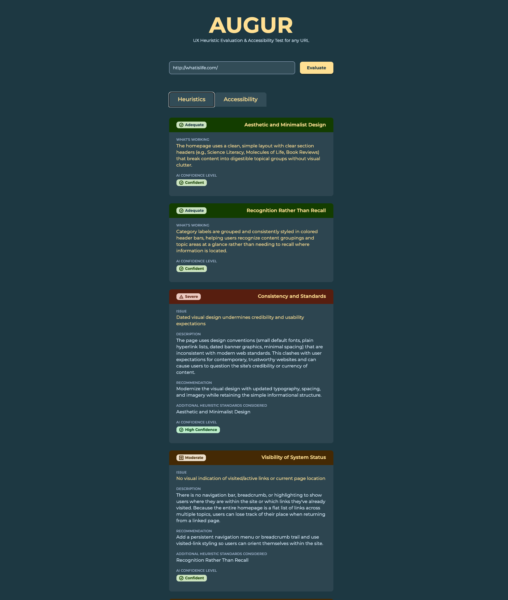
Every response comes back through Claude's tool-use API against a JSON schema, with fixed enums: Critical/Severe/Moderate/Minor for severity, High Confidence/Confident/Suspected/Uncertain for AI judgment. Confidence tagging is scoped only to heuristic findings, since accessibility findings are already verified fact, a confidence badge there would just be noise.
3) When the schema wasn't enough on its own
Despite the prompt and schema both instructing "Severe," axe-core's own internal word "serious" occasionally leaked through into the badge. The fix was a second independent layer: server-side normalization that remaps the value before it reaches the frontend, plus a client-side fallback style for any future unrecognized value. Prompting for correctness and verifying it in code aren't the same thing, and this is the specific case that proved it.
4) Making confidence show its work
Every confidence badge now carries a required one-sentence explanation, directly visible in the screenshot it's evaluating, not an inference. I also changed the "Uncertain" badge to display as "Uncertain: needs review" through a lookup table, without touching the underlying schema or styling.
04Key Decisions & Tradeoffs
Three smaller decisions carry real weight: an empty state that teaches both frameworks before a URL is even entered, an honest slow-loading state instead of a spinner, and one shared component system driving every result card so severity and rating alone determine its look.
Key Decisions & Tradeoffs
Three smaller decisions carry real weight: an empty state that teaches both frameworks before a URL is even entered, an honest slow-loading state instead of a spinner, and one shared component system driving every result card so severity and rating alone determine its look.
The empty state teaches first
The pre-submission state isn't blank. It's a short, plain-language explanation of both frameworks, written to be read before a URL is entered, so a first-time visitor understands what they're about to get before they get it.
An honest loading state
A real evaluation takes tens of seconds: launching a browser, taking a screenshot, running the scan, calling Claude. Instead of a spinner, I used a slow, cross-fading sequence of phrases, timed deliberately to read as considered rather than anxious — honest about the wait instead of hiding it.
One component system behind every card
Every result card is a Figma component built on the same token set the app's CSS uses directly. The header bar's color and icon are driven entirely by the severity or rating value, and both card types, issue and working-well, share one shell.
05How I Built It
AUGUR started as a single input field under the working name "HEURISTIC," wired to raw, unstructured Claude output, and got its real name after I'd tested it against sites designed to break my assumptions: a novelty single-purpose page and a blank solid-color page. Three real bugs surfaced only after deploying to production, each traced to a genuine serverless-specific cause, not guessed at.
How I Built It
AUGUR started as a single input field under the working name "HEURISTIC," wired to raw, unstructured Claude output, and got its real name after I'd tested it against sites designed to break my assumptions: a novelty single-purpose page and a blank solid-color page. Three real bugs surfaced only after deploying to production, each traced to a genuine serverless-specific cause, not guessed at.
From a bare prototype to a working pipeline
AUGUR started under the working name "HEURISTIC," a single input field wired to raw, unstructured Claude output. I renamed it after testing options across registers, from clinical (RUBRIK, Site-Crit) to irreverent (RoastMySite.com), and landed on a name that works as both noun and verb: it reads surface patterns to surface hidden structural truth. The rename happened before the card system, the color language, or the second evaluation lens existed.
Directing Claude Code meant working like briefing an engineering team: reviewing every response against intent, not just accepting what came back. Testing deliberately included edge-case sites — a single-purpose novelty page, a frozen 1996 relic, a solid-color block with nothing on it.
Testing against sites designed to break assumptions
A deliberately minimal novelty site didn't get penalized for "missing" navigation it never needed — arguably one of the most efficient websites in existence, and the model recognized restraint as intentional instead of flagging it as a defect. A blank solid-color page confirmed the honest failure mode I wanted: "nothing here," instead of invented findings.
What broke only in production
Three bugs surfaced only after deploying, each with a real, traceable cause:
- A script file silently dropped by Vercel's file tracing — fixed with an explicit declaration in
next.config.js, confirmed against the build trace manifest. - A serverless-Chromium binary exceeding the function size limit (64.8MB) — fixed with a variant that downloads its binary from a hosted release at cold start instead of bundling it.
- A Chromium profile directory reused across warm containers, intermittently crashing mid-navigation — fixed by giving every invocation its own disposable profile directory.
06Production Hardening
A public, unauthenticated AI tool needs protection from its own cost. I capped evaluations at three per visitor per rolling 7-day window, checked before the expensive work starts, using two independent identity signals so clearing cookies alone can't reset the count.
Production Hardening
A public, unauthenticated AI tool needs protection from its own cost. I capped evaluations at three per visitor per rolling 7-day window, checked before the expensive work starts, using two independent identity signals so clearing cookies alone can't reset the count.
Protecting the product from its own cost
AUGUR caps evaluations at three per visitor per rolling seven-day window, checked before the browser launches, before the scan runs, before Claude is ever called. Two independent identity signals, a cookie and an IP address, both have to be exhausted before a visitor is blocked; a single combined key would let clearing cookies alone reset the count. Counters live in Upstash Redis on a true sliding-window algorithm, not a fixed-TTL approximation.
The rate limiter stops casual overuse. It is explicitly not the account's real safety net — that's a separate, account-level spend cap set directly in the Anthropic Console, which caps total cost regardless of how a request got made. Neither replaces the other. Each covers a failure mode the other doesn't.
07Validation & Reflection
The two-layer architecture held up under real, unpredictable testing across dense pages, minimalist sites, and blank pages alike, all producing honest, right-sized output. The biggest remaining gap is disclosure pacing: a flat results cap can hide a real failure or pad a clean one, which is what I'd fix next.
Validation & Reflection
The two-layer architecture held up under real, unpredictable testing across dense pages, minimalist sites, and blank pages alike, all producing honest, right-sized output. The biggest remaining gap is disclosure pacing: a flat results cap can hide a real failure or pad a clean one, which is what I'd fix next.
What I'm proud of
The two-layer architecture held up under real, unpredictable testing: dense pages, minimalist sites, and blank pages all produced honest, right-sized output instead of forced or padded results. The trust signals, confidence tags, cited WCAG criteria, a real severity taxonomy, aren't decoration. They're load-bearing.
What I'd improve next
The biggest remaining gap is disclosure pacing. A flat results cap can hide a real failure on a bad page or pad out a clean result on a good one. The planned fix: a default view showing two strengths and five or six priority issues ordered by severity, with the rest revealed progressively. I'd also add annotation markers directly on the screenshot, and a shareable evaluation link that compresses a full report into a URL, no account required.
What This Demonstrates
I built AUGUR to answer a specific trust question: what does it take for a reader to actually believe an AI-generated evaluation? Every architectural choice traces back to that question — grounding the frameworks in real published standards, splitting measurement from judgment into two engines, and forcing every confidence badge to explain its own reasoning.
Cutting a framework because it failed a fidelity test, not because it was less popular, is the kind of decision that only shows up when you actually test the model's limits instead of assuming its training holds. That instinct, verify before you trust, runs through the whole build.
I designed, built, deployed, and hardened this entirely solo — including the parts that never show up in a screenshot: rate limiting, spend caps, and three separate production bugs traced to their real causes, not guessed at.