Visa Digital Benefits Platform
Every regional or tier variation of a benefit needed its own record, and the library had become unnavigable. I designed a Base/Extension inheritance model for issuing-bank admins running a live production system, with guardrails that made the system harder to break, not just easier to use. Afterward, on my own time, I directed Claude Code through a working prototype of an evolved version of the same model, to test that it held up under real interaction.
Highlights
- Replaced one-off duplicate records with a live Base/Extension inheritance model: a grandchild benefit inherits from its parent, which inherits from its grandparent, with certain attributes locked at the parent level so a downstream edit can't silently break something three levels away.
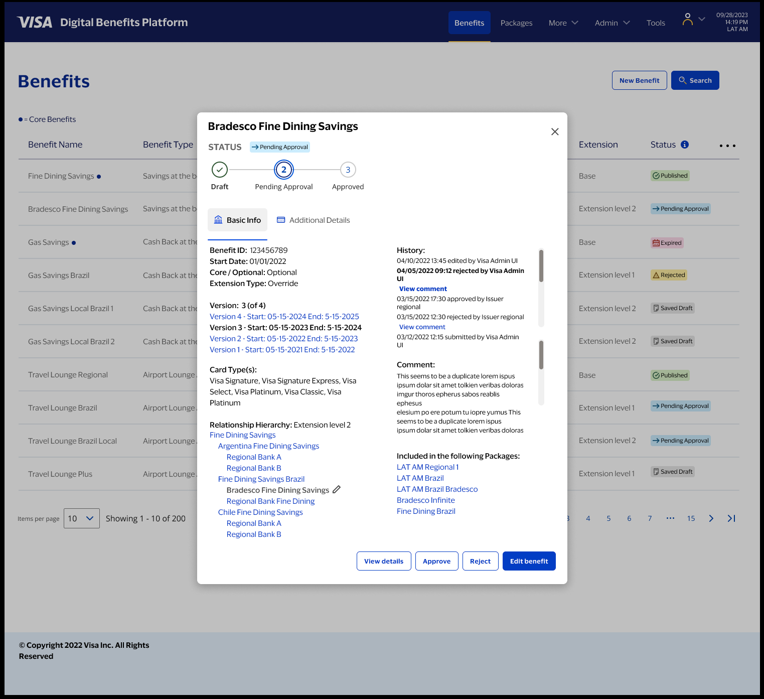
- Quick-view overlays, my own idea, let admins approve, reject, or flag a record without leaving the menu. Admins reported this sped up the approval workflow 15–20%.
- Developed the Objects/Attributes/Actions framework, a named method for mapping a system's existing grammar before extending it, then reused it at the scale of the whole benefit/package relationship.
- Personally directed Claude Code through a working prototype of the model post-engagement. Testing the actual build caught a real bug three generations deep in the hierarchy that a design review alone would have missed.
01Project Brief
Visa doesn't decide what a cardholder's benefits are — the issuing bank does, through Benefits grouped into Packages and assigned to BINs, the digit ranges printed on the card. When I joined, the system had no organizational structure: every variation had to be built from scratch as its own record, and the library had become an unnavigable pile the system was already live in production, so the fix had to work without retraining the bank teams already running it.
Project Brief
Visa doesn't decide what a cardholder's benefits are — the issuing bank does, through Benefits grouped into Packages and assigned to BINs, the digit ranges printed on the card. When I joined, the system had no organizational structure: every variation had to be built from scratch as its own record, and the library had become an unnavigable pile the system was already live in production, so the fix had to work without retraining the bank teams already running it.
The one thing to know first
Visa doesn't decide what a cardholder's benefits are. The issuing bank does, through the Visa Digital Benefits Platform: build a Benefit (airport lounge access, purchase protection, a concierge line), group benefits into a Package, then assign packages to BINs, the digit ranges printed on the card, which is the actual mechanism that hands a cardholder access to what's inside. Everything below is really about making that one workflow trustworthy at scale, for banks processing thousands of regional and tier variations at once.
Overview
When I joined the project, the system had a foundational problem: no organizational structure. Every variation of a benefit had to be built from scratch as its own record. Over time, the benefits library had become an unnavigable pile, and teams at issuing banks like Bradesco were slowing down, making errors, and losing confidence in the system.
My role was to design a way out of that. The critical constraint: we couldn't start over. The system was already in production. Issuing-bank teams at major global banks, Bradesco, BBVA, and others, used it daily. They knew its quirks and had built workflows around it, and couldn't afford retraining on an entirely new product. The new features had to feel like natural extensions of what they already knew, not a replacement.
Why this project matters
Benefits configuration sits at the intersection of policy, money, and operational risk. A misconfigured benefit isn't an abstract UX failure. It can break cardholder entitlements across an entire region. That reality shaped every design decision: the goal wasn't just to make the system easier to use, it was to make it harder to break.
02Discovery & Design Process
Research surfaced two personas in real tension: Carolina, an analyst who loses time re-finding records she already created, and Ricardo, a manager who approves 20-40 records a week and loses his place in the queue mid-review. I mapped the system's existing grammar with a named framework, Objects/Attributes/Actions, before extending it, and turned ten synthesized pain points into eight direct design fixes across a three-phase, six-month build.
Discovery & Design Process
Research surfaced two personas in real tension: Carolina, an analyst who loses time re-finding records she already created, and Ricardo, a manager who approves 20-40 records a week and loses his place in the queue mid-review. I mapped the system's existing grammar with a named framework, Objects/Attributes/Actions, before extending it, and turned ten synthesized pain points into eight direct design fixes across a three-phase, six-month build.
Where I started
I needed to understand the live production system deeply before touching it. I ran workshops, worked with a UX research partner, and mapped the system in FigJam before ever opening Figma proper — the structure had to make sense before it had a visual layer.
What the system actually does
Issuing banks configure Benefits, grouped into Packages, assigned to BINs (Business Identification Numbers, the first four to eight digits of a card number) — the actual mechanism connecting a benefit to a cardholder. Every benefit and package carries its own lifecycle: created, configured, submitted, approved or rejected, published, and eventually expired or replaced.
Two personas, two different ways of thinking
Carolina, a Card Products Analyst at Bradesco in São Paulo, is process-oriented, not technical. Her own words: "I know the benefits process inside out. The system is what slows me down. I spend half my time searching for records I've already created."
Ricardo, a Card Products Manager in Rio de Janeiro, reviews 20–40 approvals a week. His own words: "By the time I've opened a record, found what I need to compare, and navigated back, I've lost my place in the queue. I'm approving on incomplete information." Role-based access split cleanly along these lines: analysts create, configure, and submit; managers approve, reject, or flag, without the creation workflow — a split that directly shaped the quick-view overlay decision later.
Mapping the journey, and where it broke
I mapped Carolina's journey across six stages: trigger, search and research, create, configure, submit for approval, package and assign. Her emotional arc never produced confidence at any single stage — neutral, frustrated, resigned to errors, anxious, uncertain, relieved but nervous.
Turning pain points into design questions
I synthesized ten real pain points into three categories: structural ("no hierarchy, everything is a flat list"), procedural ("admins afraid to touch existing records, unsure what will break"), and interpersonal ("no clear way to communicate rejection reasons back to Carolina, creating back-and-forth email loops"). Each became a How Might We question driving the next phase.
The Objects/Attributes/Actions framework
Before proposing anything new, I mapped the system's existing grammar: its Objects (Benefit, Card Type, Budget, Qualification, Supplier, Package, Link), its Attributes (internal name, status, region, benefit type, cost structure, approval state), and its Actions (Cancel, Add Link, Save Draft, Submit, Duplicate, Create Extension). Only then did I propose new Objects (Base Benefit with extension children, Benefit Spend Tiers, Coverage, Language Version) and new Actions (Add Tier, Add Redemption, Upload Document, Navigate via Section Sidebar). Naming the existing grammar first meant every new piece extended a pattern admins already knew, instead of introducing an unfamiliar one.
Eight pain points, eight fixes
Every variation requiring a new record became the Base/Extension model with inheritance. A benefit disappearing after submit with no status visibility became a three-step Approval Stage wizard as a first-class status. All eight pain points mapped this directly, one to one, to a shipped solution.
Six months, three phases
September 2022 to February 2023: Phase 1 built the Parent-Child/Base-Extension model, Phase 2 added Tiers, Phase 3 rebuilt the Benefits & Packages menu. I deliberately overlapped Phase 2's low-fidelity design with Phase 1's usability testing, and used a six-week December 2022 engineering freeze to finish Phase 2's high-fidelity work, so implementation could start the moment the freeze lifted.
03The Model Shift
The parent-child model was the founding premise before I joined; my job was making it real in the interface and solving every edge case underneath it. A base benefit is defined once, and children inherit its rules while selectively overriding others — live, not copied. Get it wrong, and cardholders lose benefits they're entitled to, so every inheritance relationship needed explicit indicators and clear conflict messaging.
The Model Shift
The parent-child model was the founding premise before I joined; my job was making it real in the interface and solving every edge case underneath it. A base benefit is defined once, and children inherit its rules while selectively overriding others — live, not copied. Get it wrong, and cardholders lose benefits they're entitled to, so every inheritance relationship needed explicit indicators and clear conflict messaging.
From duplication to structure
VDBP's real relationships are many-to-many: a benefit can belong to multiple packages, and a package can hold dozens of benefits. The parent-child model was the founding premise before I joined the project. My job was making it real in the interface and solving every edge case it created underneath.
A base benefit is defined once. Children inherit its attributes, coverage rules, eligibility logic, geographic constraints, and can selectively override specific ones. Critically, the hierarchy is live, not copied: a change to the base benefit propagates to every child that hasn't overridden that particular attribute.
The risk in that is real, and I named it plainly to the team: build the extension model wrong, and existing packages break. Cardholders lose benefits they're entitled to. Banks file complaints. The response wasn't to avoid the risk — it was to design against it directly, with explicit guardrails, visible inheritance indicators, and conflict messaging that explains exactly why something is blocked, instead of just blocking it.
04Business Need & Success Criteria
Without inheritance, every regional variation meant a full duplicate record, multiplied across dozens of banks and thousands of variations. Success meant five concrete outcomes: eliminate duplication without losing regional flexibility, make relationships explicit and navigable, surface approval states clearly, prevent invalid configurations before they propagate, and keep the interface comprehensible as complexity grows.
Business Need & Success Criteria
Without inheritance, every regional variation meant a full duplicate record, multiplied across dozens of banks and thousands of variations. Success meant five concrete outcomes: eliminate duplication without losing regional flexibility, make relationships explicit and navigable, surface approval states clearly, prevent invalid configurations before they propagate, and keep the interface comprehensible as complexity grows.
The business problem
No inheritance meant full duplicate records for every regional variation, multiplied across dozens of banks and thousands of variations. That duplication was the direct cause of the unnavigable library Carolina and Ricardo were both fighting.
What "success" meant
- Eliminate duplication without sacrificing regional flexibility.
- Make relationships explicit and navigable instead of implicit and buried.
- Surface approval states clearly, so nothing disappears into an unknown status.
- Prevent invalid configurations before they propagate to live cardholders.
- Keep the interface comprehensible as the system's real complexity keeps growing.
05Key Decisions & Tradeoffs
Three decisions did most of the work: menus that surface hierarchy and approval state as first-class information, not buried metadata; quick-view overlays, my own proposal, that let a manager approve, reject, or flag without ever leaving the menu; and a persistent sidebar that answers "what is this, what does it belong to, what inherits from it" on every page.
Key Decisions & Tradeoffs
Three decisions did most of the work: menus that surface hierarchy and approval state as first-class information, not buried metadata; quick-view overlays, my own proposal, that let a manager approve, reject, or flag without ever leaving the menu; and a persistent sidebar that answers "what is this, what does it belong to, what inherits from it" on every page.
1) Decision-ready menus
I made hierarchy and approval state first-class information in the menu itself, not something an admin has to click in to find. Status badges, Saved Draft, Pending Approval, Published, Expired, Rejected, are scannable at a glance across the whole list.
2) Quick-view overlays
This was my own idea, and it turned out to be the most-cited improvement in user feedback. An overlay lets a manager see status, history, hierarchy, and attributes, then approve, reject, or flag, without ever leaving the menu. Admins reported this sped up the approval workflow 15–20% — a direct answer to Ricardo losing his place in the queue every time he had to navigate away and back.
3) A persistent sidebar as the mental map
Every benefit and package page carries a sidebar showing the object's hierarchy, and on package pages, a tier-level cost and responsibility breakdown between Visa and the issuer. It answers one question, consistently: what is this object, what does it belong to, and what inherits from it?
06Configuration Depth & States
Beneath the hierarchy sits real configuration depth: layered rule attributes for eligibility tiers, coverage limits, currencies, and regional constraints, plus multi-market localized content and clear failure-state messaging that never loses the admin's place mid-task.
Configuration Depth & States
Beneath the hierarchy sits real configuration depth: layered rule attributes for eligibility tiers, coverage limits, currencies, and regional constraints, plus multi-market localized content and clear failure-state messaging that never loses the admin's place mid-task.
Depth, localization, and failure states
Every benefit carries layered rule attributes: eligibility tiers, coverage limits, currencies, time periods, and regional constraints, all of which can be inherited or overridden at any level of the hierarchy.
Language and attachments. Packages sold across markets need localized content, not just translated labels — different regions require different supporting documents and disclosure language, and the interface had to make managing that variation direct instead of a workaround.
Error handling. When a configuration fails validation, the interface needed to say exactly why, in place, without losing the admin's position in a long form. A vague error at this depth of nested configuration cost real time to diagnose.
07Packages: Governance & Inheritance
Packages inherit and cascade benefits from their own parent packages, and the system actively blocks adding a benefit that's already redundant with what a parent already includes, explaining the conflict in context instead of just refusing the action. Operational tooling, like time-based renewal email settings, rounded out the package layer as the product matured.
Packages: Governance & Inheritance
Packages inherit and cascade benefits from their own parent packages, and the system actively blocks adding a benefit that's already redundant with what a parent already includes, explaining the conflict in context instead of just refusing the action. Operational tooling, like time-based renewal email settings, rounded out the package layer as the product matured.
Benefit inheritance and cascading display
A package is both an object and a container. The interface shows benefits inherited and cascaded from parent packages directly, so an admin never has to guess what a package actually contains once inheritance is factored in.
Preventing conflicts when adding benefits
The system blocks adding a child benefit if its parent package already includes it, since that would be redundant or contradictory. The constraint shows up in context, with an explanation of why, rather than a bare rejection.
Operational tooling: renewal email settings
Time-based renewal reminders and notifications were added as the product matured — a smaller feature, but one that closed a real operational gap admins had been managing manually.
08From Design to Working Software
On my own time after the engagement ended, I directed Claude Code through a working front-end prototype of an evolved version of this hierarchy, to test whether the interaction model held up when it was actually clickable. It caught two real bugs a static design review would have missed — one three generations deep in the hierarchy, one in how decisions sorted into history.
From Design to Working Software
On my own time after the engagement ended, I directed Claude Code through a working front-end prototype of an evolved version of this hierarchy, to test whether the interaction model held up when it was actually clickable. It caught two real bugs a static design review would have missed — one three generations deep in the hierarchy, one in how decisions sorted into history.
A personal follow-up, on my own time
Everything above is real, delivered Visa work. This part is separate: after the engagement ended, I used Claude Code independently to build a working front-end prototype, testing whether the interaction model held up when it was clickable, not just describable. I directed the build from a detailed functional spec across sessions: menu and overlay, benefit page, a Create Extension action that actually clones parent data through two extension levels, unique data flowing correctly across the menu, and a working Approve/Reject/Comment loop with persistent state.
The real payoff came at the third level. The relationship hierarchy display correctly tracked the immediate parent at two generations deep, but silently pointed at the wrong ancestor once a third generation existed — an edge case invisible until I'd actually built and inspected it. A design review alone would not have caught this.
Making the approval workflow actually decide something
Approve, Reject, and Add Comment are live in the prototype, not decorative. Rejecting writes a real history entry and status change without a page reload, and that state persists on revisit. A second real bug surfaced here: an early version of the timestamp logic borrowed a value meant for a different purpose, so a fresh decision sorted into the middle of the history instead of on top. I caught it by testing the interaction, not by reading the code.
A build log kept in real time
Claude Code kept a running, session-by-session log: what got built, what broke, what got corrected, and why. Reading it back, it reads less like a highlight reel and more like an engineering changelog — which is the point.
09Reflection
The system grew more complex, more tiers, more states, more edge cases, without becoming brittle, and the frameworks I built early (OAA, the guardrails, the overlays, the sidebar) all held up under that growth. What I'd want next: a "what will change?" preview before an admin publishes a cascading edit, and I'd want to prototype that the same way I built the extension hierarchy, not just design it on paper.
Reflection
The system grew more complex, more tiers, more states, more edge cases, without becoming brittle, and the frameworks I built early (OAA, the guardrails, the overlays, the sidebar) all held up under that growth. What I'd want next: a "what will change?" preview before an admin publishes a cascading edit, and I'd want to prototype that the same way I built the extension hierarchy, not just design it on paper.
What I'm proud of
The system got more complex over time, more tiers, more states, more edge cases, without becoming brittle. The OAA framework, the guardrails, the quick-view overlays, and the persistent sidebar all held up as that complexity grew, rather than needing to be rebuilt around it.
"Most of all: we didn't break anything. In a system where a bad configuration can affect real cardholders at a major bank, that's not a small thing."
What I'd improve next
I'd want a "what will change?" preview before an admin publishes a cascading edit, showing exactly which downstream records would be affected before the change goes live. And I'd want to prototype that the same way I built the extension hierarchy: by actually clicking through it, not just designing it on paper.
What This Demonstrates
I designed VDBP to answer a specific systems question: how do you let a live, in-production platform get more flexible without getting easier to break? Every decision traces back to that constraint — the Base/Extension model, the guardrails around it, the quick-view overlays, the persistent sidebar.
I mapped the system's existing grammar with a named framework before extending it, then reused that same method at the scale of the whole benefit/package relationship. That's a repeatable way of working on legacy systems, not a one-off insight specific to VDBP.
Directing Claude Code through a working prototype afterward wasn't a demo exercise. It caught two real structural bugs a design review alone would have missed — proof that testing an interaction model by building it finds things that describing it doesn't.